Bizz Redesign exercise | 2007
Team
Fernanda Groeataers
Sidney Freitas
My contributions
Structural studies
Typographical studies
Ideation
Graphic Design of some sections
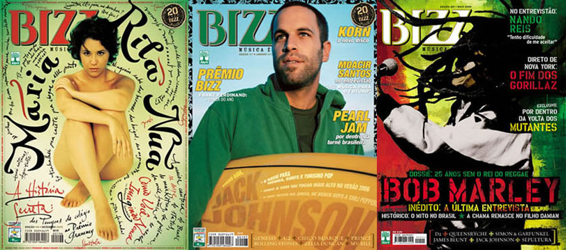
We had the challenge of redesigning Bizz, a brazilian music magazine, while maintaining the amount of content, pages and adspace.
Freedom through the structure
From the start, we realized that we had designers with very different styles that had to work together in a cohesive product. Some had more of a freestyle while others preferred to work with structure. A music magazine also didn't ask for a very structured base.
We soon came to the conclusion that we would need parameters that would allow each style to come out in the final product while bringing them together. So we decided to create a structure that would give us the freedom we wanted.
Our 12 column grid allowed each section to have a layout that adapts to the length and style of each content.
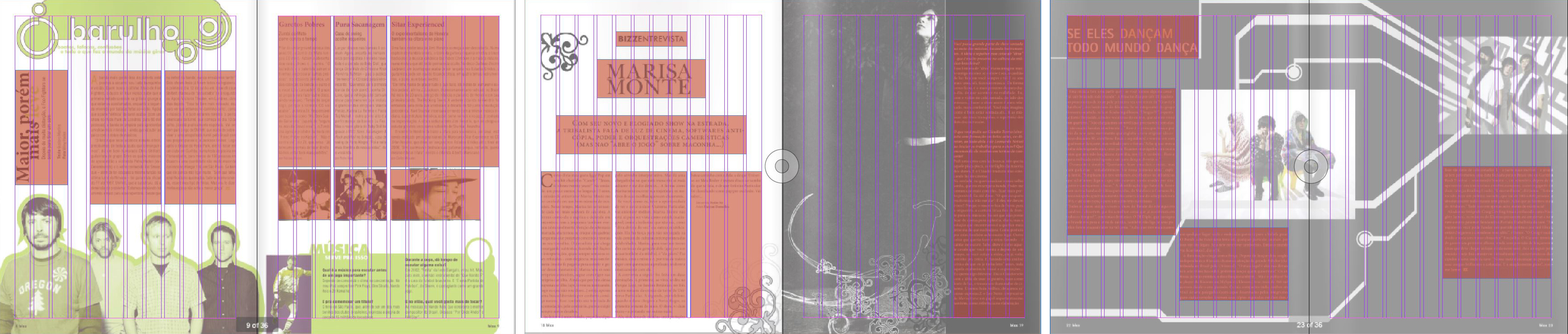
A typographical study allowed all the columns to have a ratio of characters per line that is enjoyable to read while accommodating the dense content of the magazine. This defined the minimum and maximum column widths.
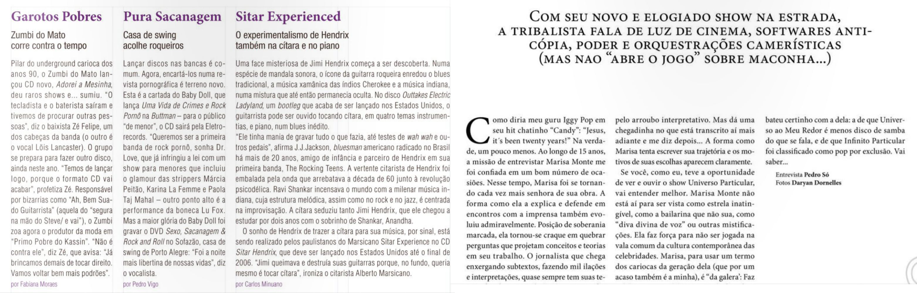
The main sections that would require a longer reading engagement would have wider columns and would use the serif font. These sections also had more freedom in color and title font choices.
The shorter sections would have thinner columns and would use the sans-serif condensed font for the main content. These would also follow a similar color scheme, also fulfilling the requirement that some of the pages had to be produced in duotone.
This allowed us to maintain the same amount of pages, content and ad-space as the original magazine, while improving the amount of breathing space in the layout.
And this is what we came up with:
Previous Project
OVNILab Brand
Branding and Visual Identity

Next Project

Video graphics
Videos, animations and motion graphics.