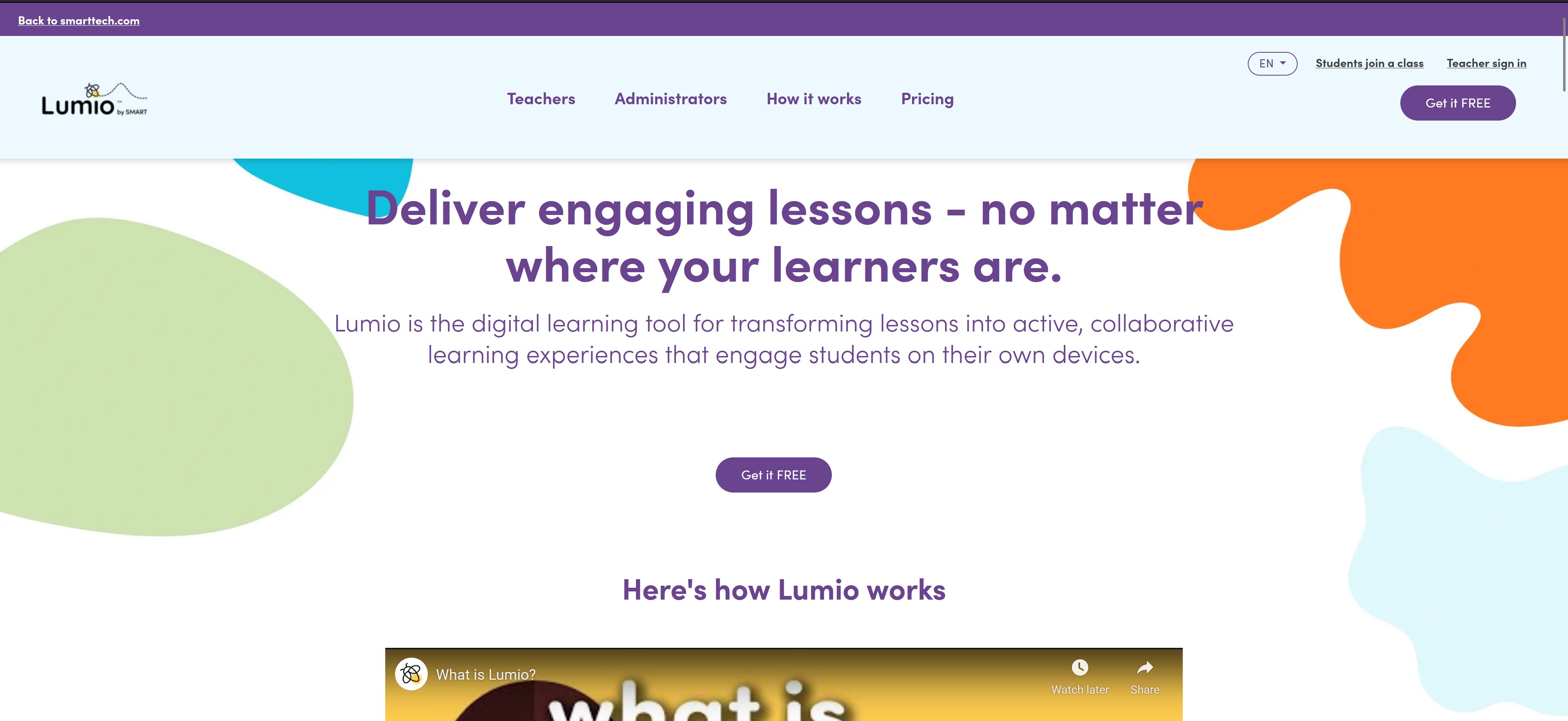
Lumio | 2019-2022
SMART Technologies
Prime Senior UX Designer
UX Team
Alison Douglas (UX Manager)
Lena Atzaba
Luiza Senra
Mohamed Noorden
Todd Agnelo
Yeh-Eun Lee
My contributions
UX Design
Information architecture
User Research
Graphic Design
Process improvements
Coordinate UX execution
Informing roadmaps
Contributed with team hiring and onboarding
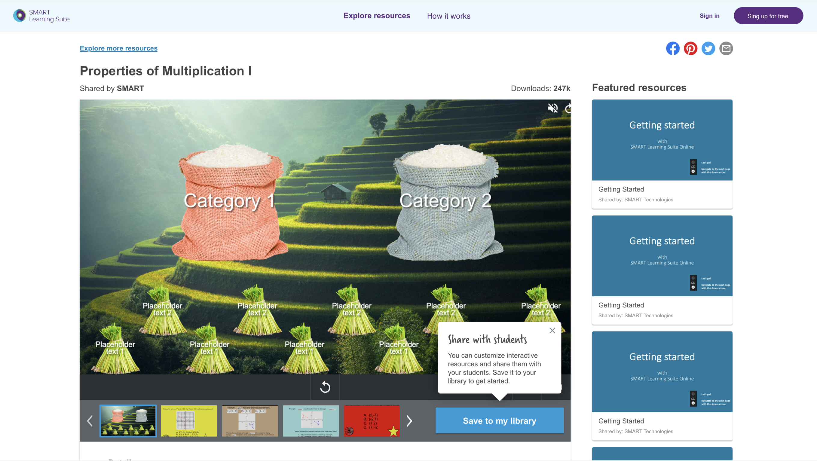
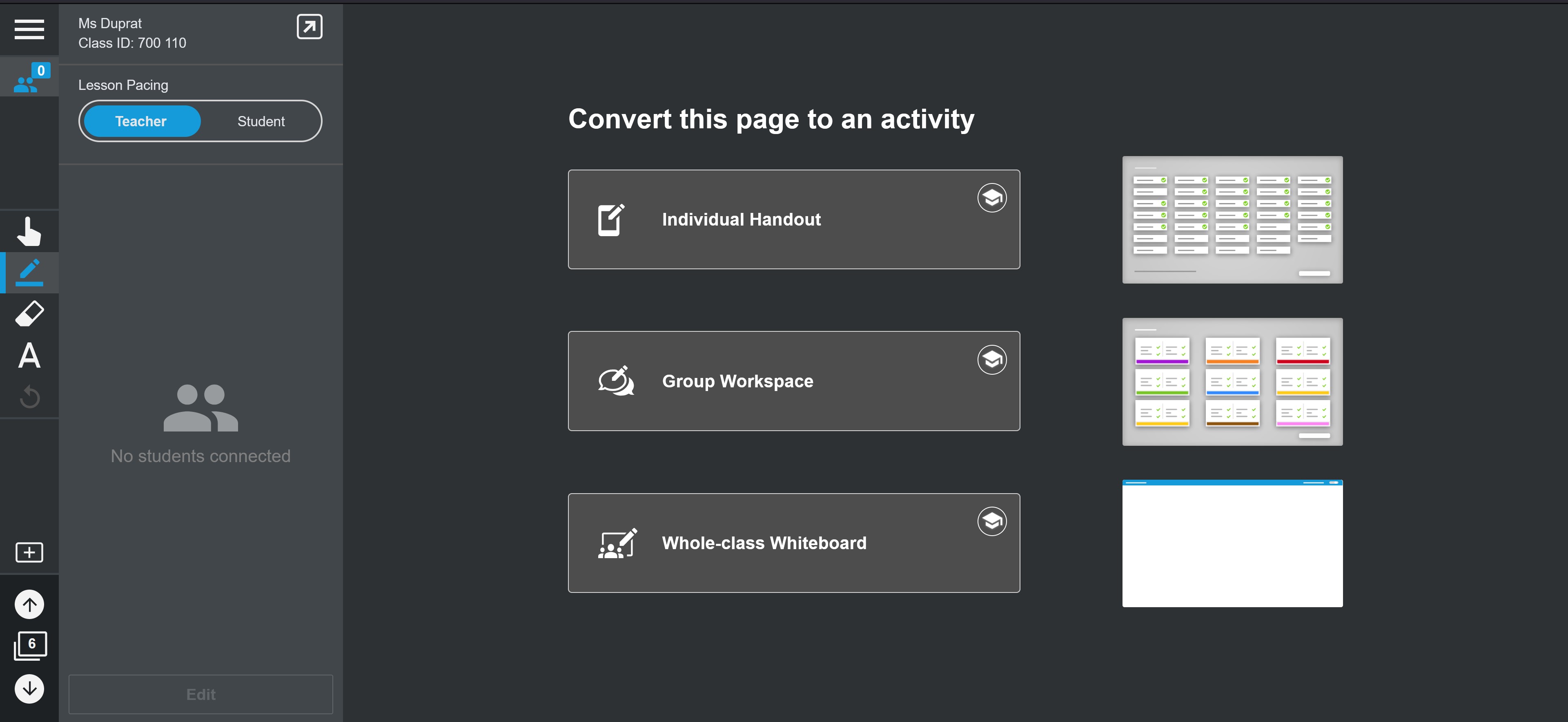
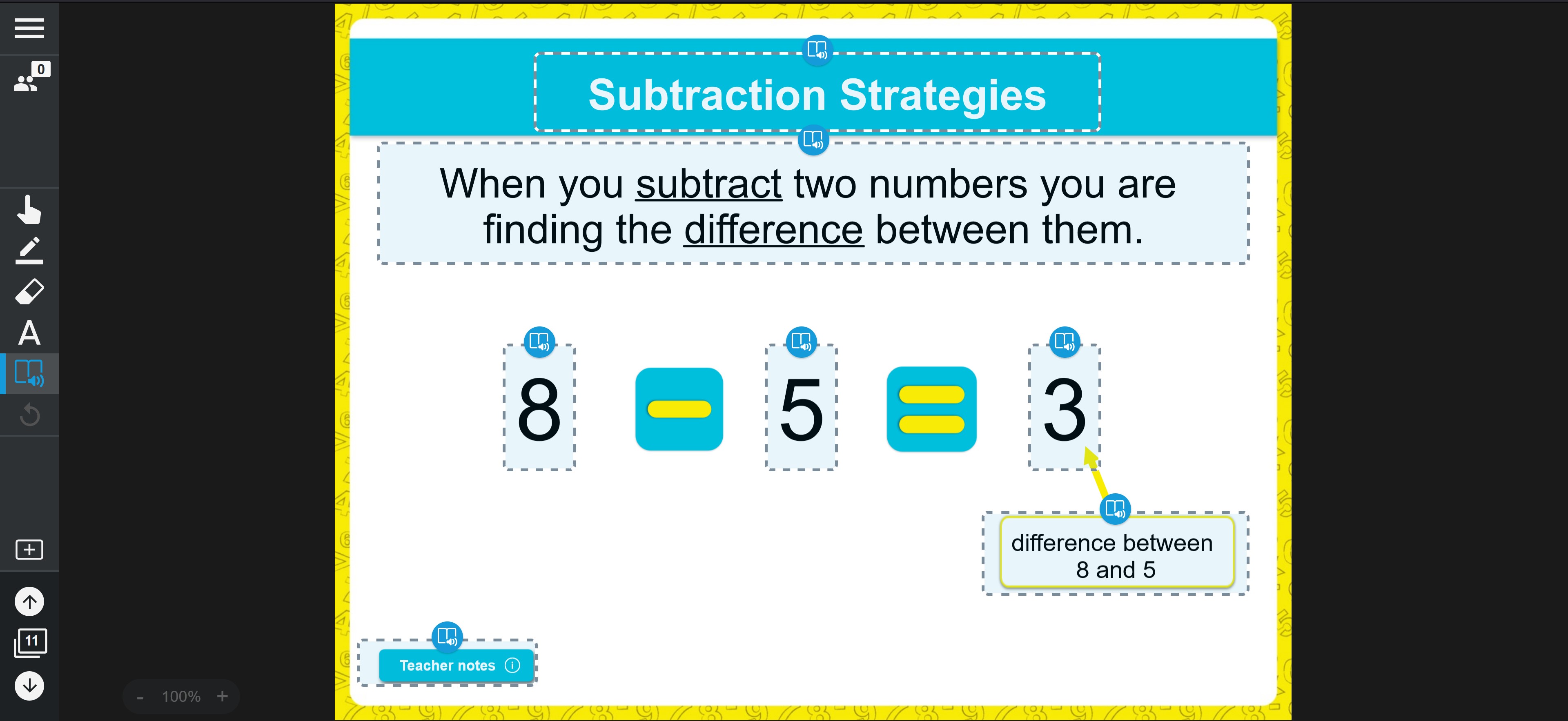
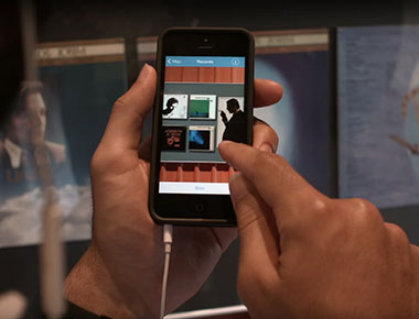
Lumio is a lesson creation, delivery and content sourcing platform for K-12 teachers and students.
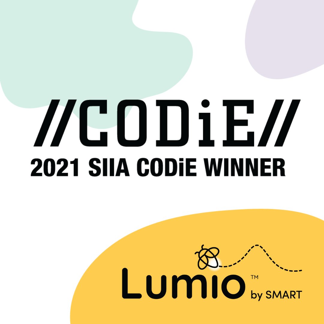
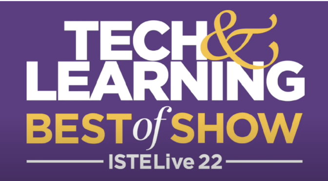
Winner of several EdTech awards

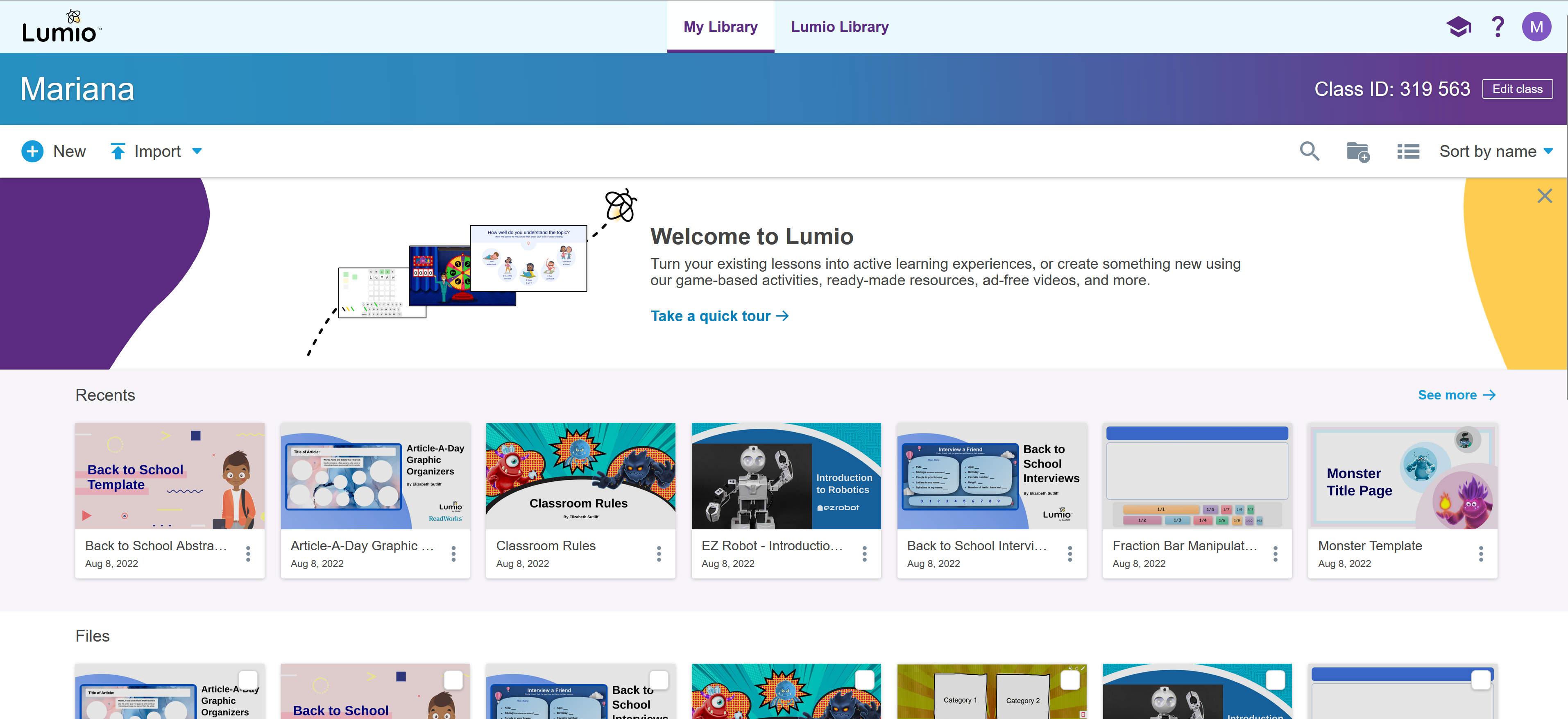
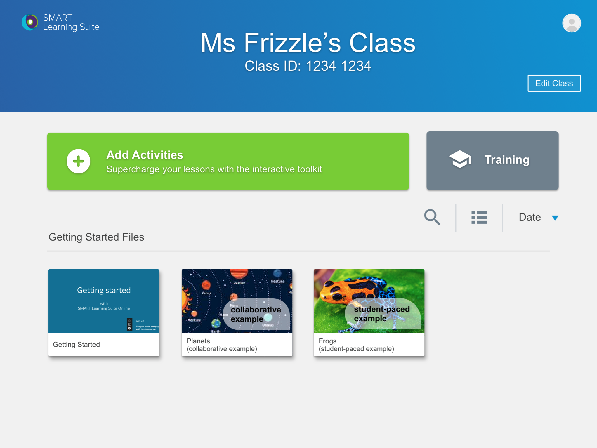
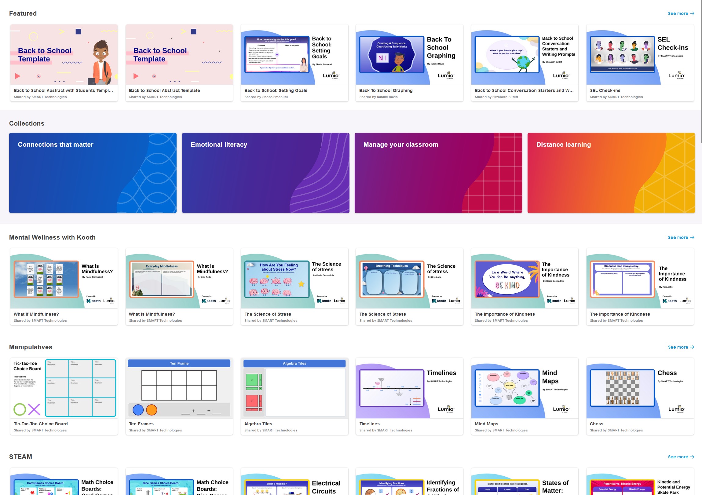
AFTER: Current Lumio interface
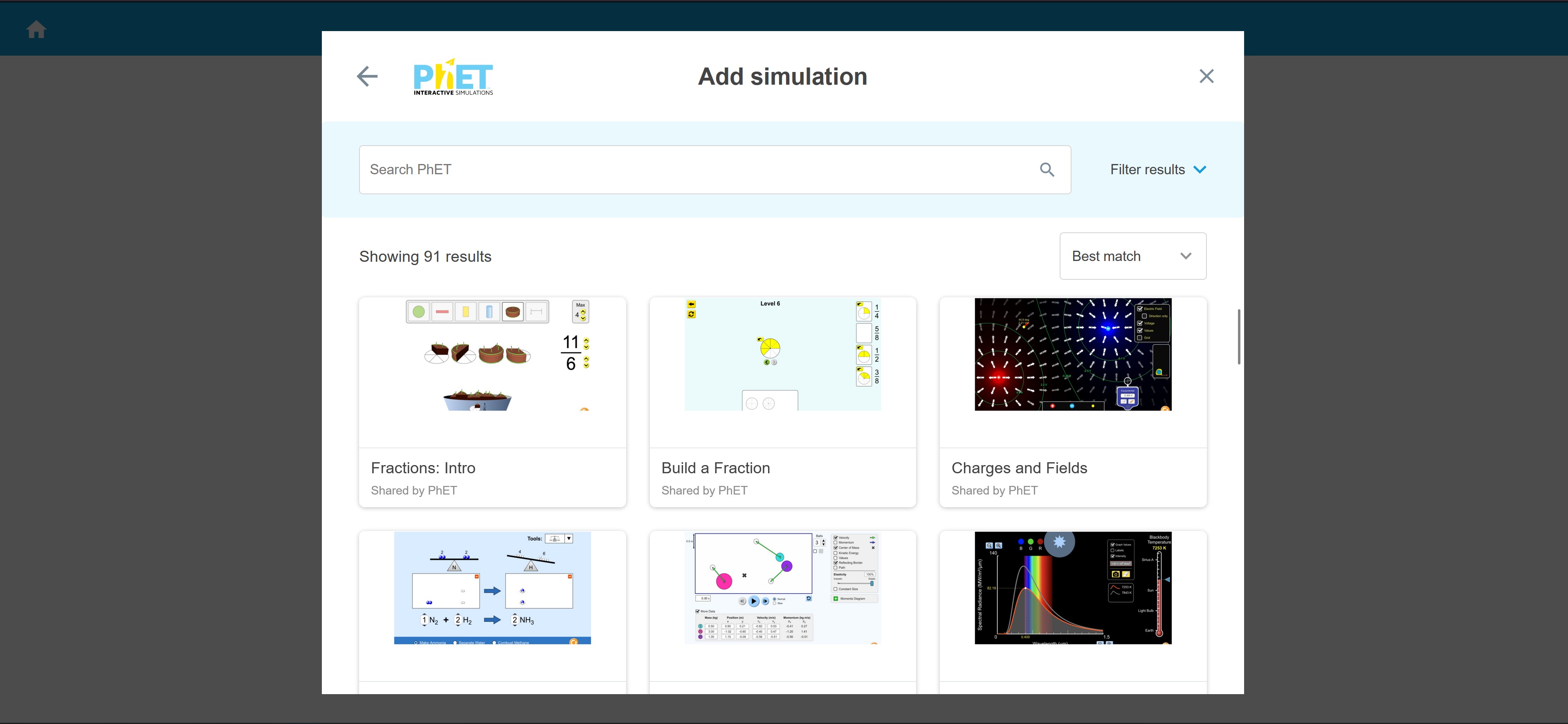
Content + Searching + Creation + Delivery
I was brought in as the prime UX designer on Lumio with the intent of bringing together some products that I had worked on in the past and to create a B2C offering:
- Quality educational resources
I had worked on creating lessons and activities as a proof of concept of what we could do internally. As a part of this initiative, I helped hire and onboard the first team of PM + teachers + graphic designer to create great quality pedagogical content that we could offer in this product. - Resource database and searching
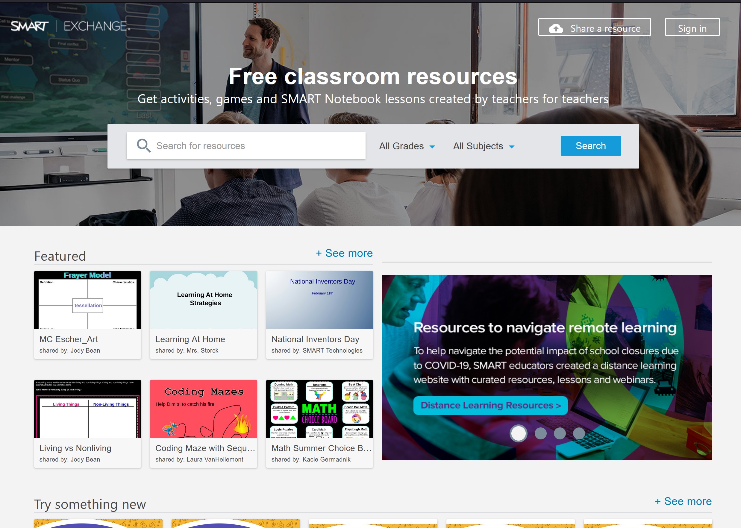
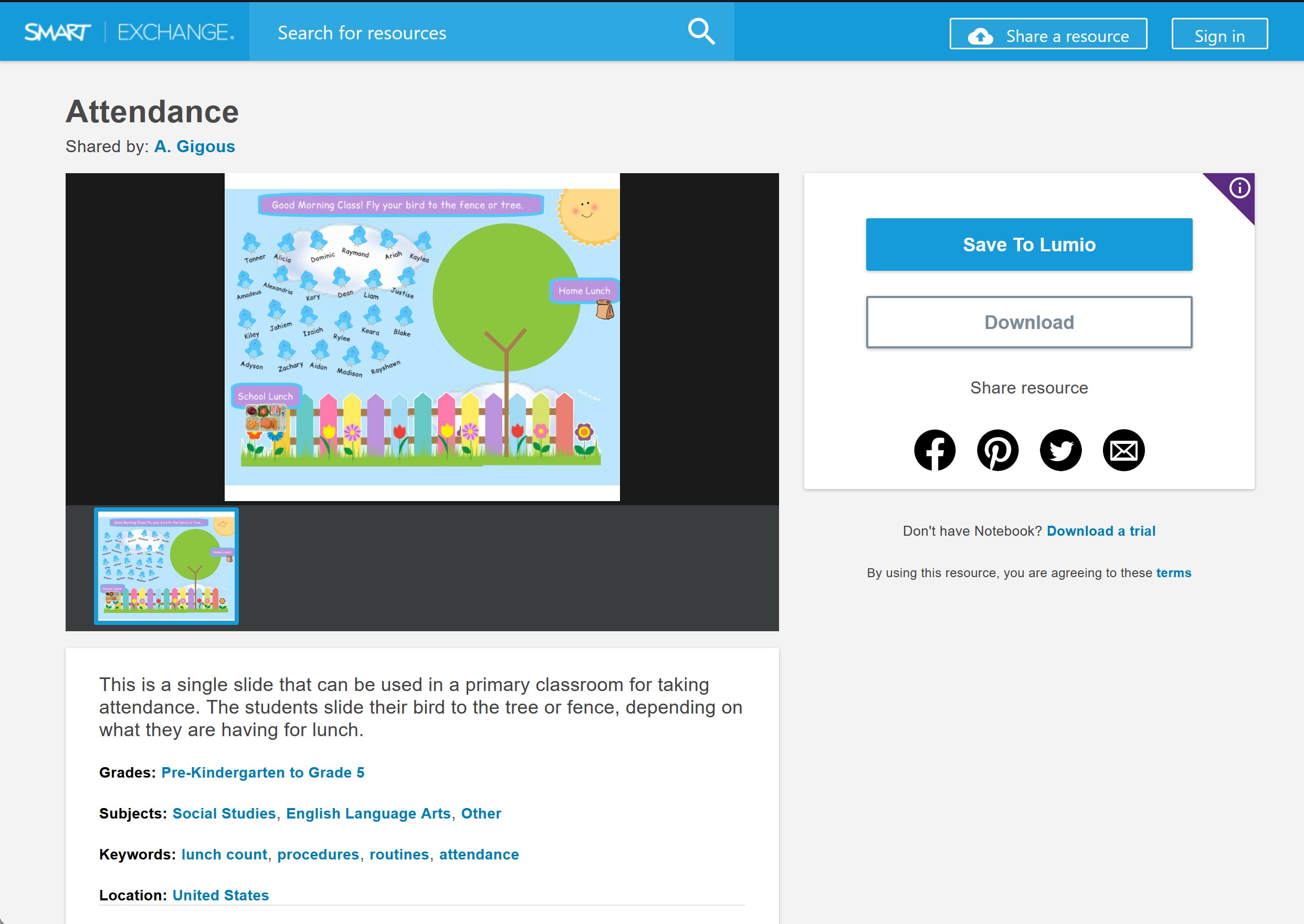
I had been the prime UX designer on the SMART Exchange product. We wanted to bring the educational resources and searching capability and combine it with the lesson creation powers of the Lumio product. - Content creation and delivery
As I had worked creating content within our tools, I had gained a unique insight into the gaps in our creation processes that I was able to bring into the Lumio product.
BEFORE: Original product screens that needed to be combined and improved
Team and processes
As part of this initiative, we had to expand our UX team to deliver the amount of features required in a short timeline.
We also needed to spin up the company's first content team, who would focus on creating great quality content from different perspectives:
- Great pedagogical knowledge to demonstrate how our tools can drive student outcomes and adapt to the best pedagogical practices
- Great visuals that would create a coherent experience for users seeing the different resources on a page
- Resources that were easy to adapt for various grades and subjects
I helped with the hiring and onboarding of both the UX and the content teams.
For the content team, I wanted to make sure that the content we created was based on some of the latest pedagogical research, so I led the team during their onboarding process on an exercise of dispelling myths in education and on sharing out some of the latest revised research of effective practices.
This team went on to create amazing resources, as well as partnering with great third party content providers and adapting their content to make the best use of Lumio while driving great pedagogical outcomes, following best teaching practices and looking visually coherent and appealing to teachers.
For the UX team, I realized that the company never had a proper aligned and documented process for the UX Designers. To help with that, I worked with the UX team, Project Management and Development Managers to come up with and document our UX process. This led to improved onboarding for the new designers, reduction of silos, less backtracking and a reduced coginitive load on the team.
This is a quick overview of some steps that made it into the process:
- Scoping
- Consider accessibility guidelines and checklist
- Work with data team to create the goals, signals and metrics for this feature
- Consider any legal or privacy concerns and check with legal team, if needed
- Plan any necessary user research with the research team
- Get high level alignment of any cross-product feature
- Consult with training, support, Marketing and sales teams to confirm we have all the necessary pieces and we're supporting their efforts
- Build flows and wireframes considering responsive design needs
- Design
- Build out any necessary onboarding or new feature modals for this feature
- Revise all strings with documentation and consider translation dates
- Consider all edge cases and error states (messaging, loading animations, etc)
- Final responsive designs should consider translation string sizes
- Include the dev working on technical designs in discussions
- Implementation
- UX designers should be included in test planning
- Final UX review with devs of implemented work
- UX designers should be invited to broad testing sessions
Navigation
As part of the initial work for the Lumio project, I worked on defining the navigation between the different parts and to improve the lesson creation process, taking advantage of all the new resources that we would have available.
With the new areas of the product, we had more areas that could be accessed by logged out users, so we started exploring how the navigation would work between the signed out and signed in areas and the differences when users are signed in.
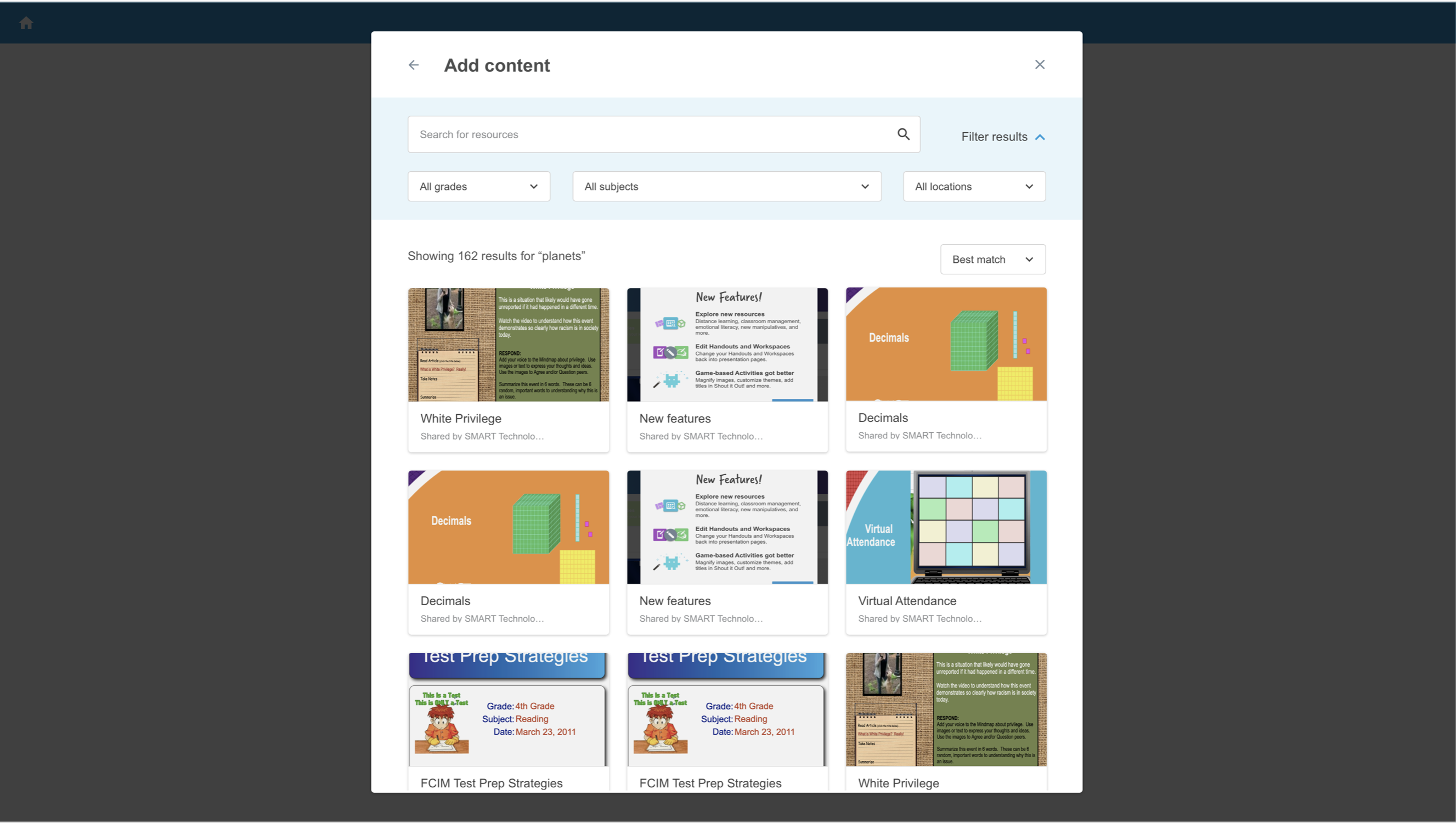
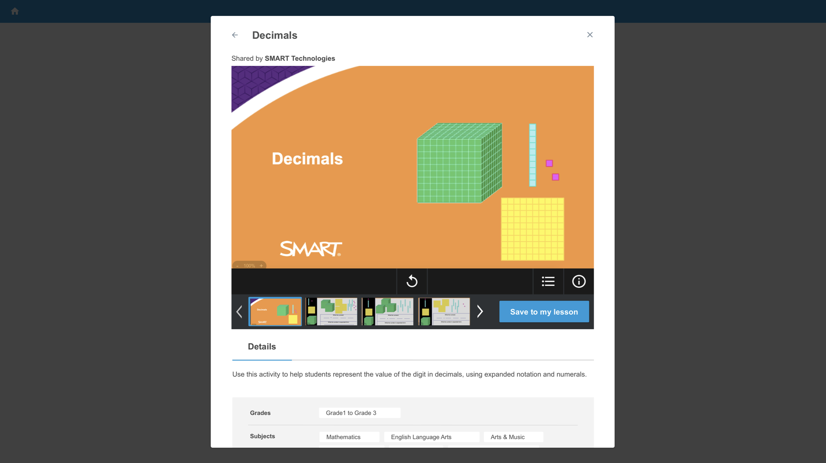
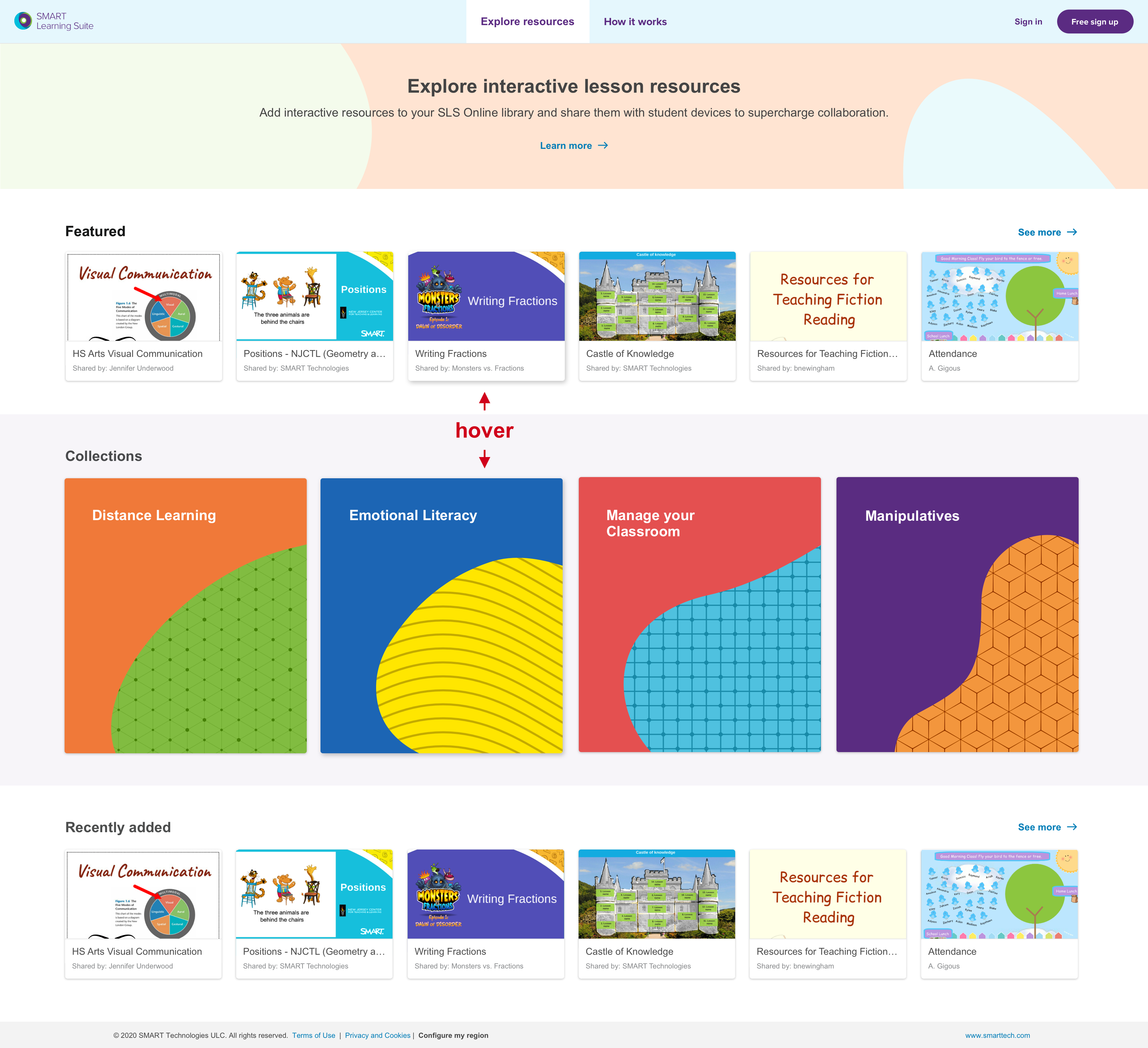
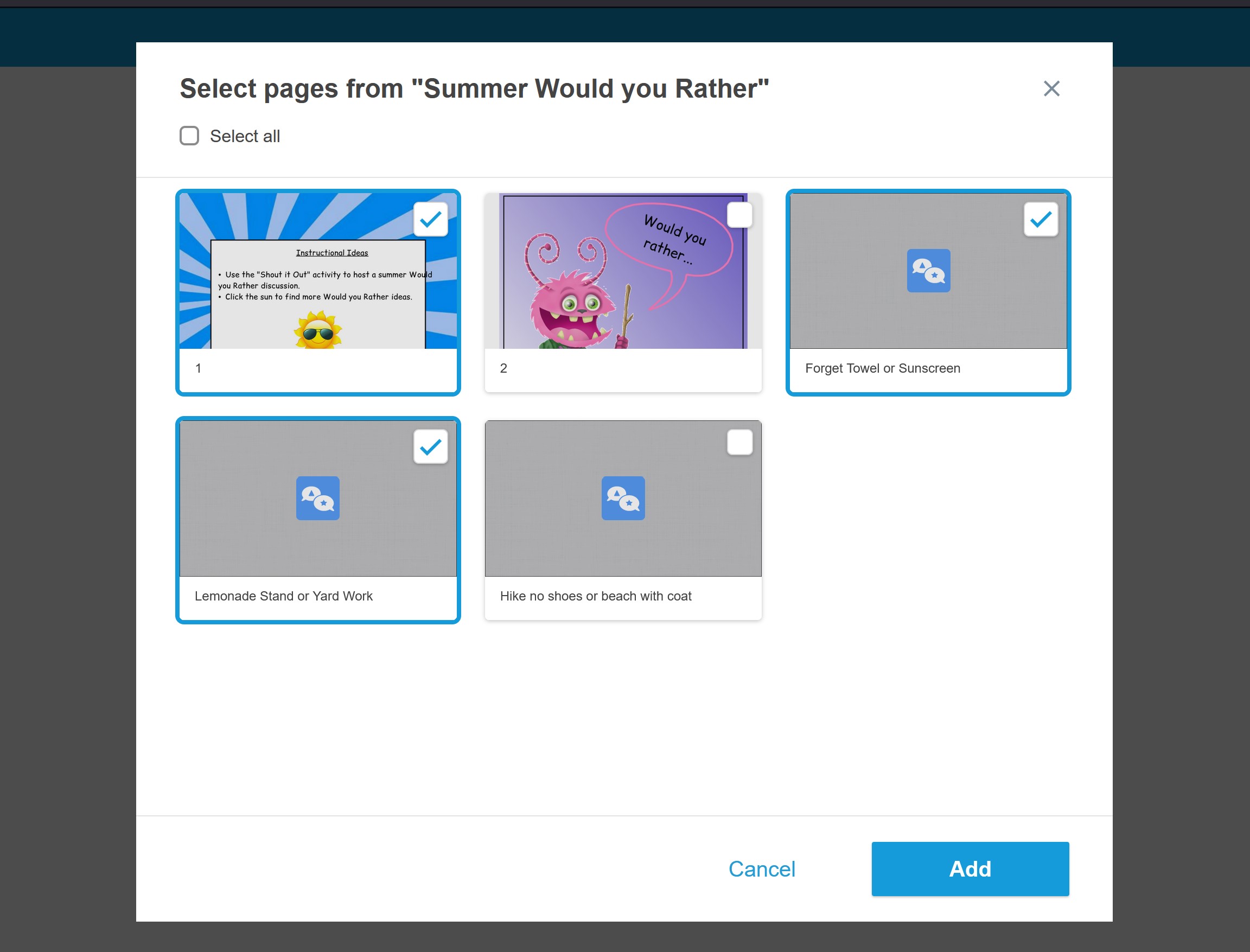
Given that we would have a library of educational resources that teachers could source from, we also created flows that allowed for users to navigate the library and:
- Create new lessons using the existing resources from the library as a starting point or
- Add these resources (or parts of them) to their existing lessons.
After we came to a high level alignment, some of these flows were then executed by other UX Designers in the team, with my consultation.
Visual Identity
For our initial release of the combined product, we did not have the time to do a full revision of our visual identity within the product. Therefore, we decided on a gradual transition approach, in which any page that had more contact with the Marketing page would have a hybrid visual treatment that incorporated elements from both the new branding and the original visual identity of the products. We ended up with a gradual transition of the two very different visual styles that still made the product seem coherent overall.
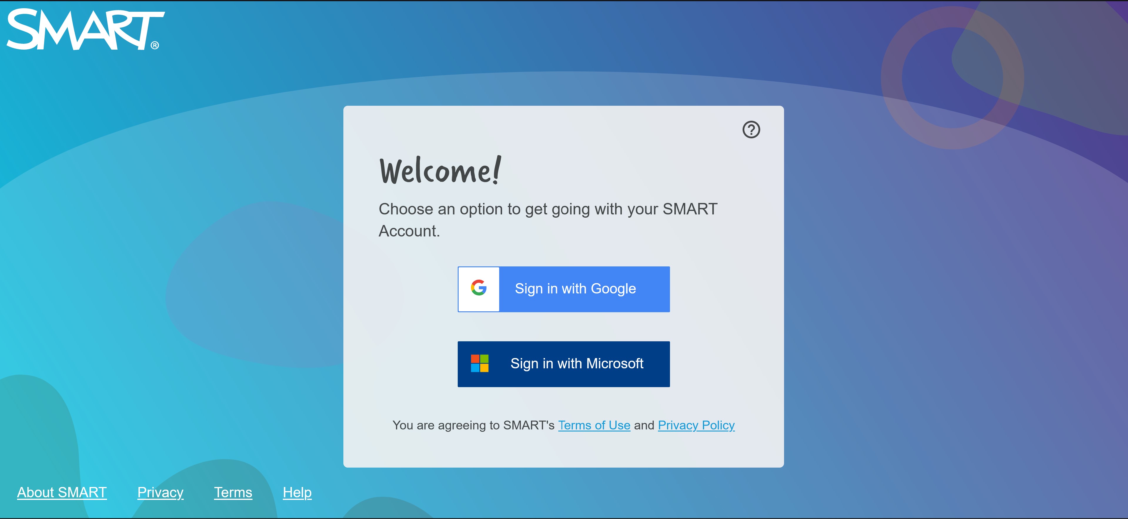
B2C flows
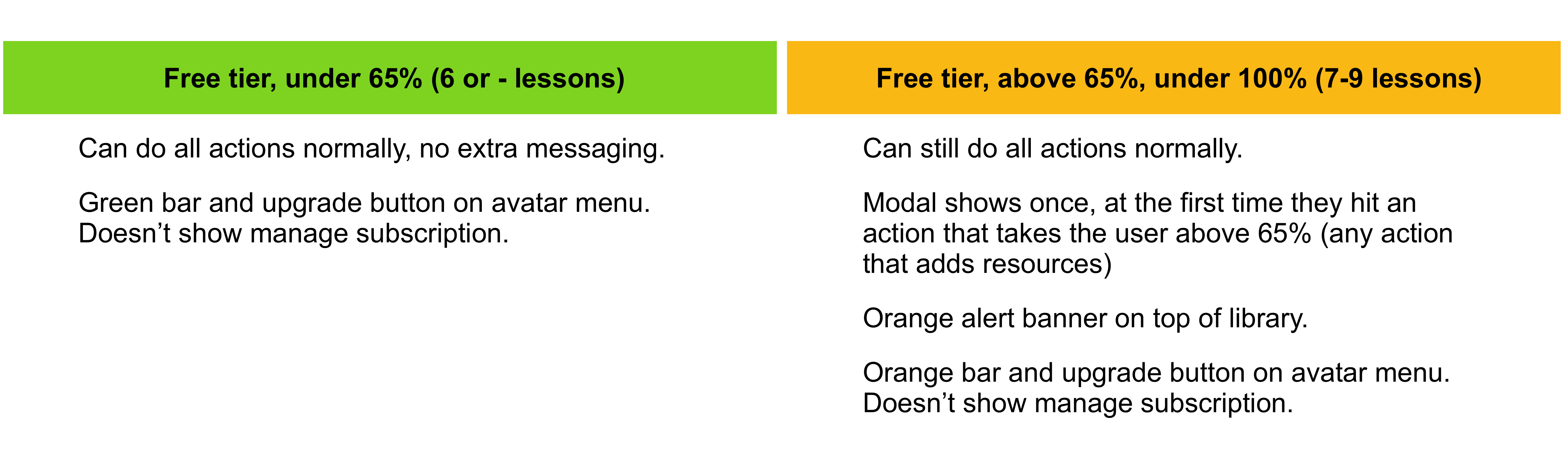
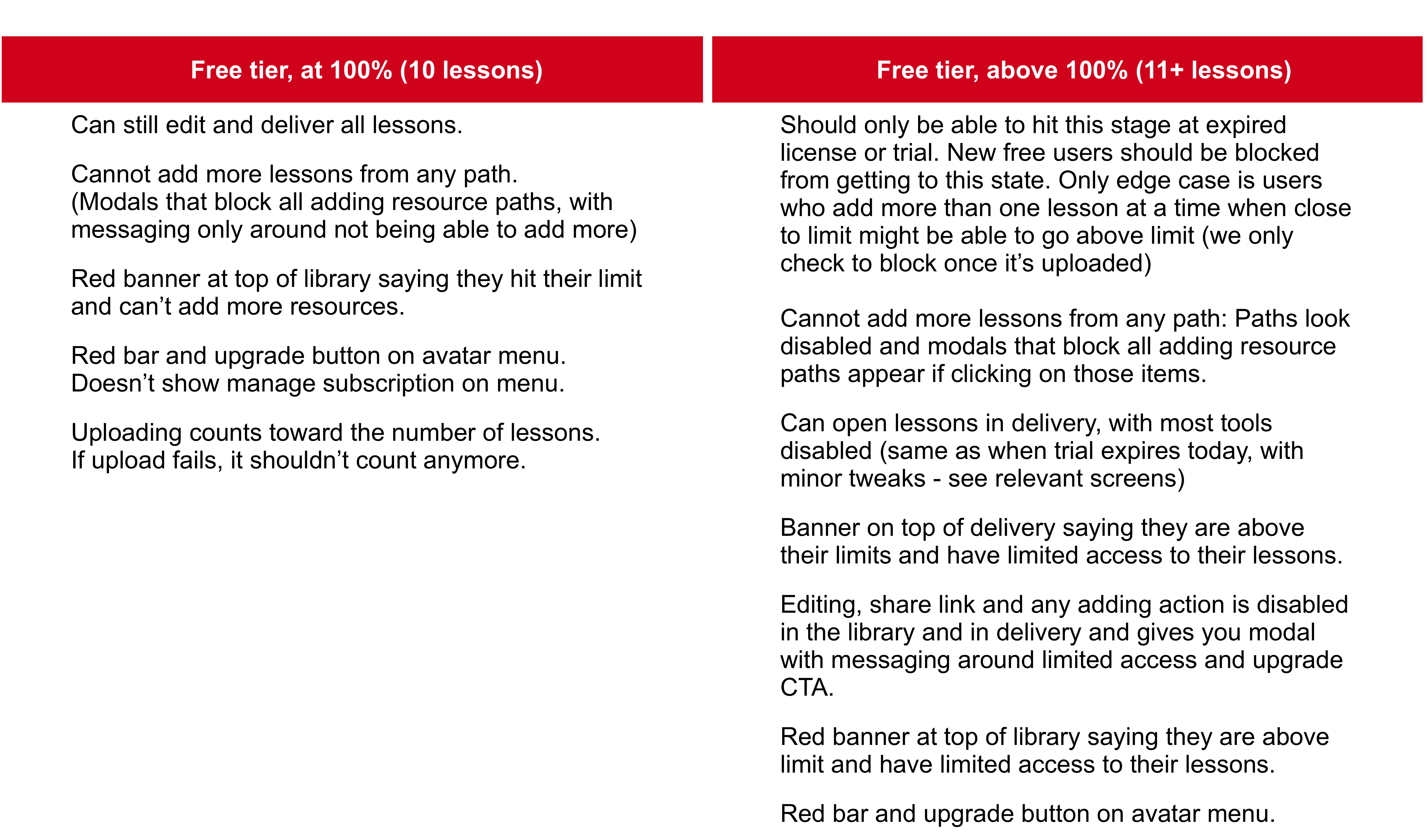
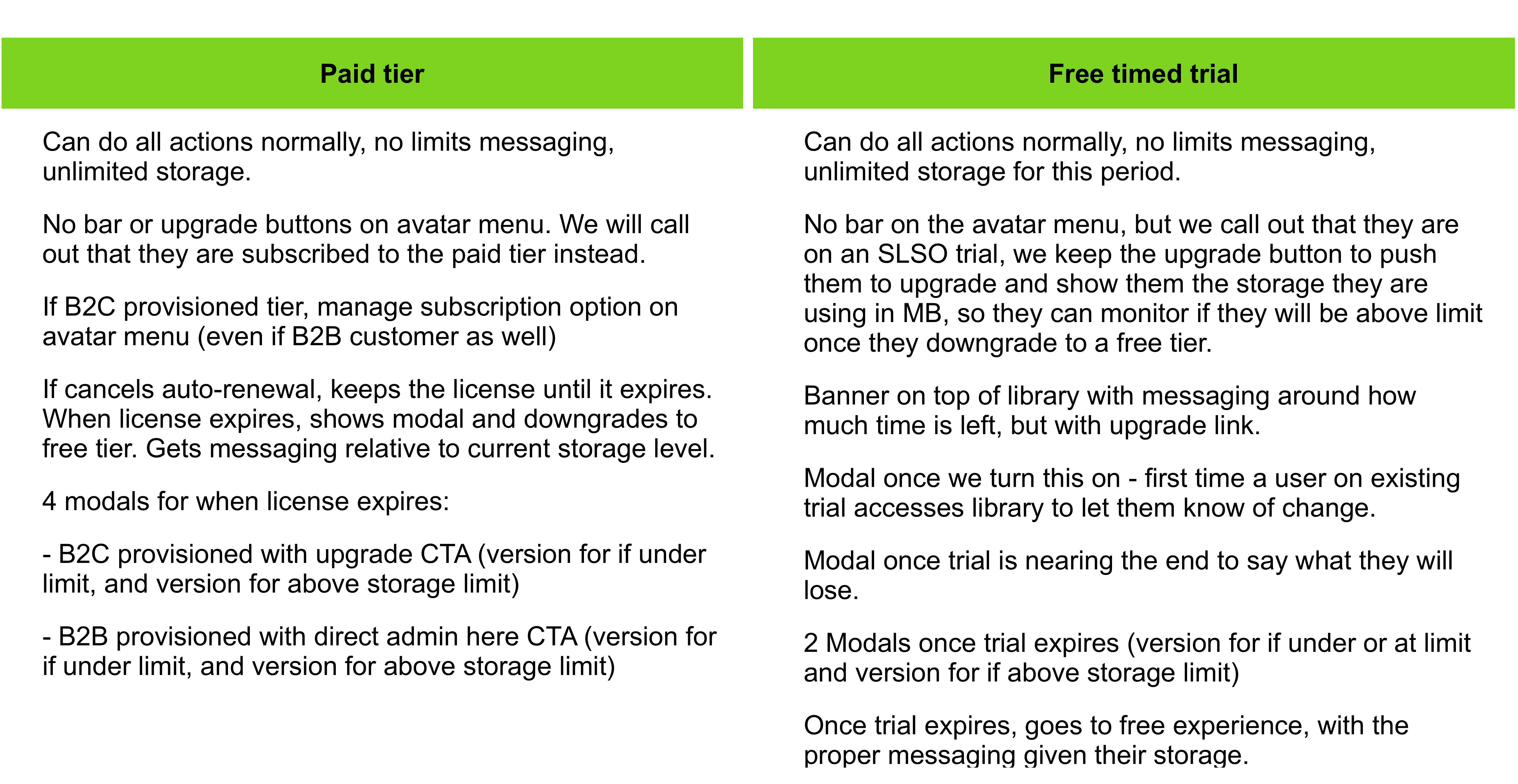
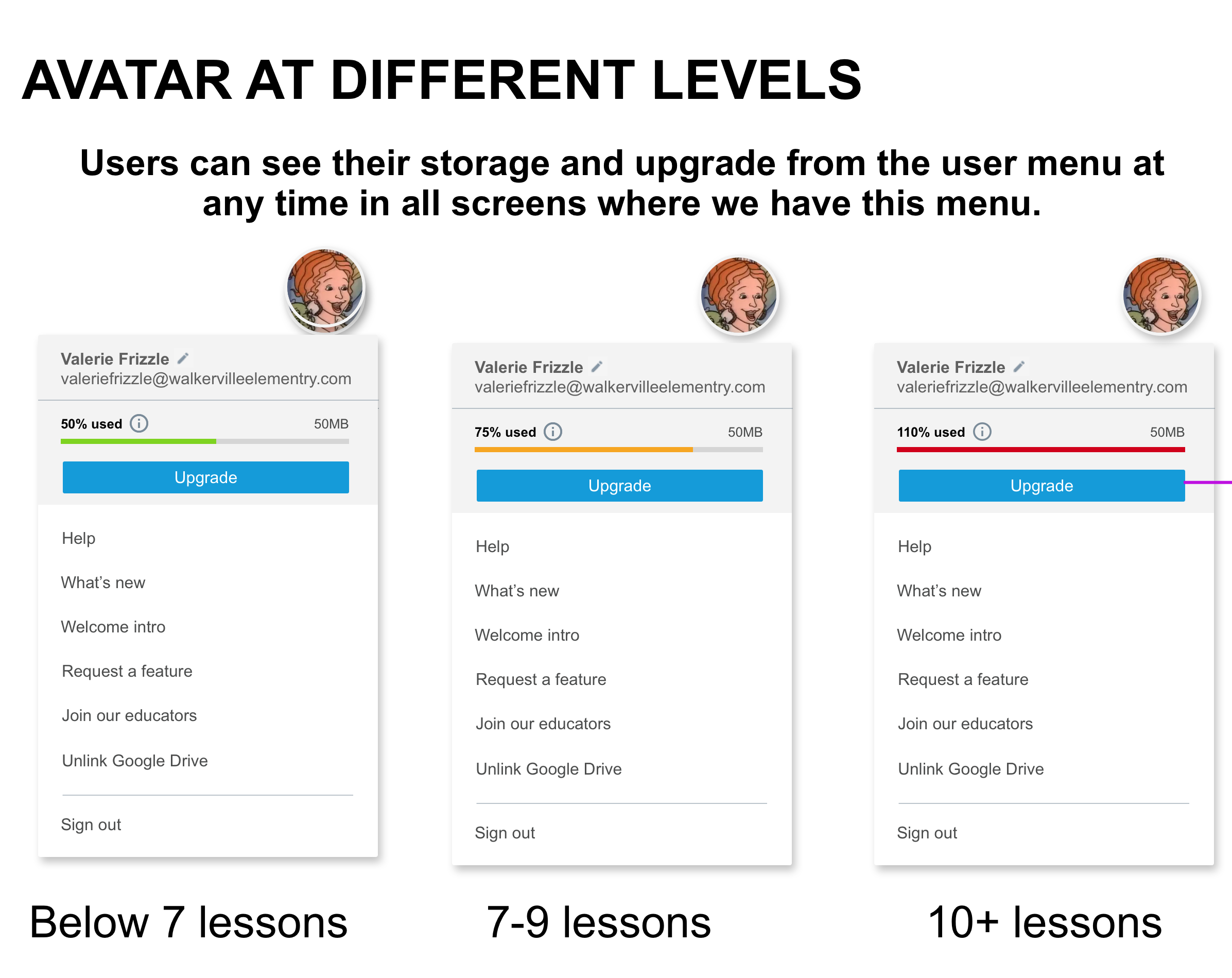
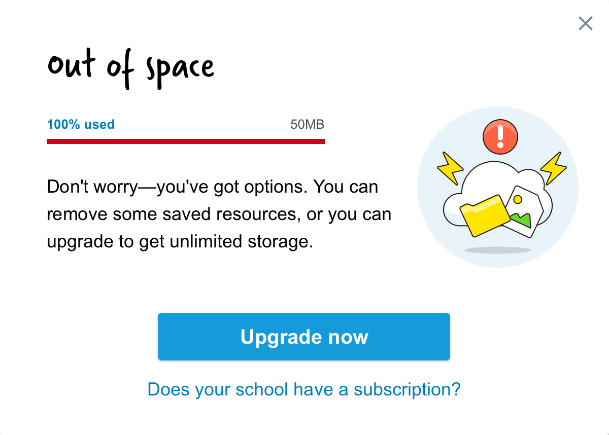
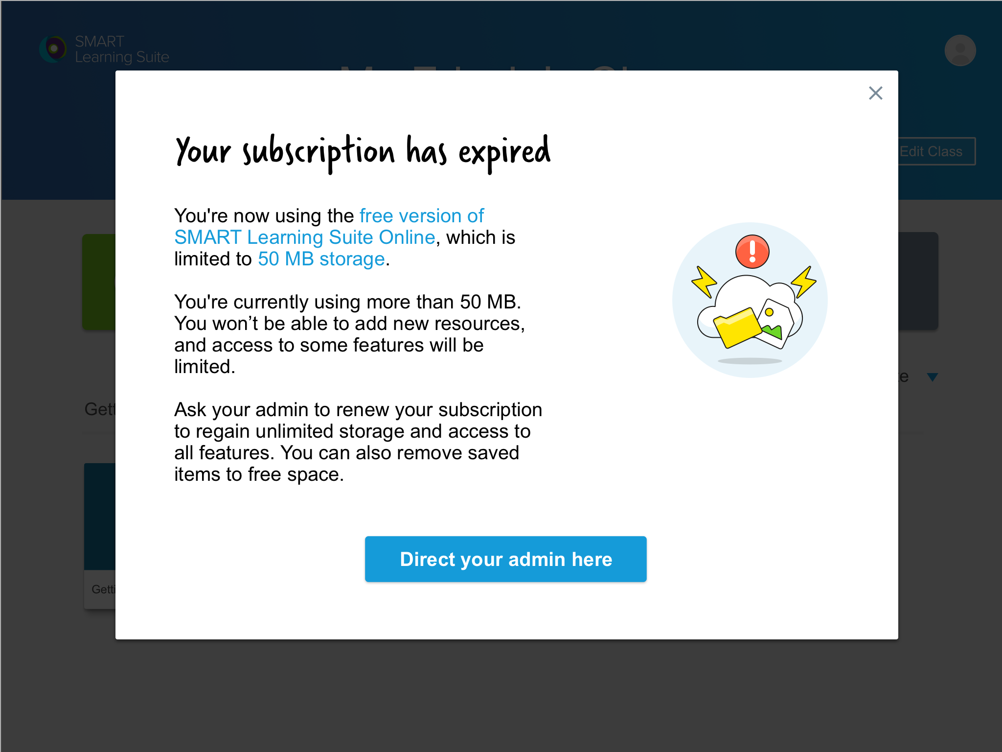
One important part of this new initiative was to create a freemium model with free and paid B2C (Business to Customer) direct to teacher flows. I worked on creating the proper messaging at all steps of the user's journey and rules for when they would show, based on the limitations of storage size/number of lessons that they could have in their personal libraries on a free account.

Continuous feature improvements
The team continued to improve the product throughout the year, adding many important creation, collaboration, file organization, and other features that were missing, updating the new name and branding and doing accessibility reviews to make sure it fit into the required parameters to pass WCAG 2.0.
I supported the team with feedback, coordinating the execution, improving processes and in making sure that we were addressing these features in the best way for our users while keeping consistency with existing features, while I took some features that required more cross-product alignments or high level overview of the product myself.
Improved navigation, homepage and onboarding
As the product grew and we got results from the User Research of several features, we realized that we had some critical navigation and onboarding issues, since the product was doing a lot more than it was originally designed to. Users were lost on where to start from, some people had issues leaving the lesson delivery mode and the library of great resources that we built was not getting enough traffic.
I was tasked with fixing some of these issues and making our homepage and navigation more future proofed for some new larger features that we have in the horizon.
Creation paths
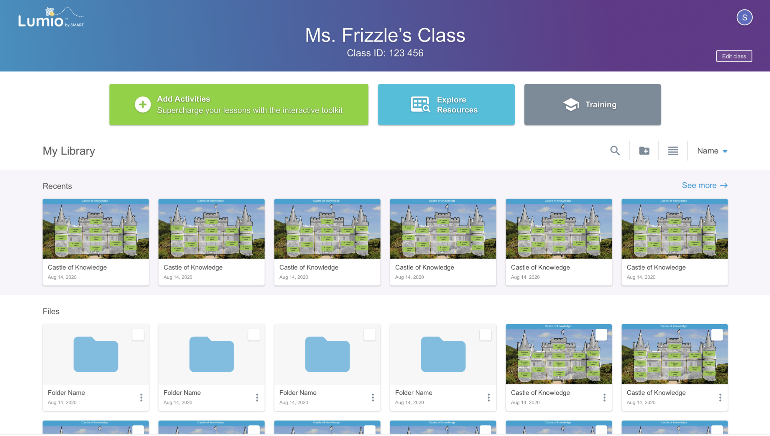
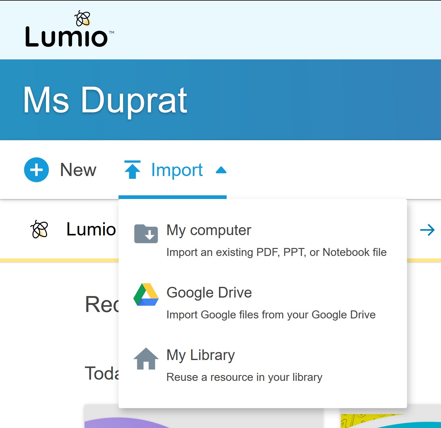
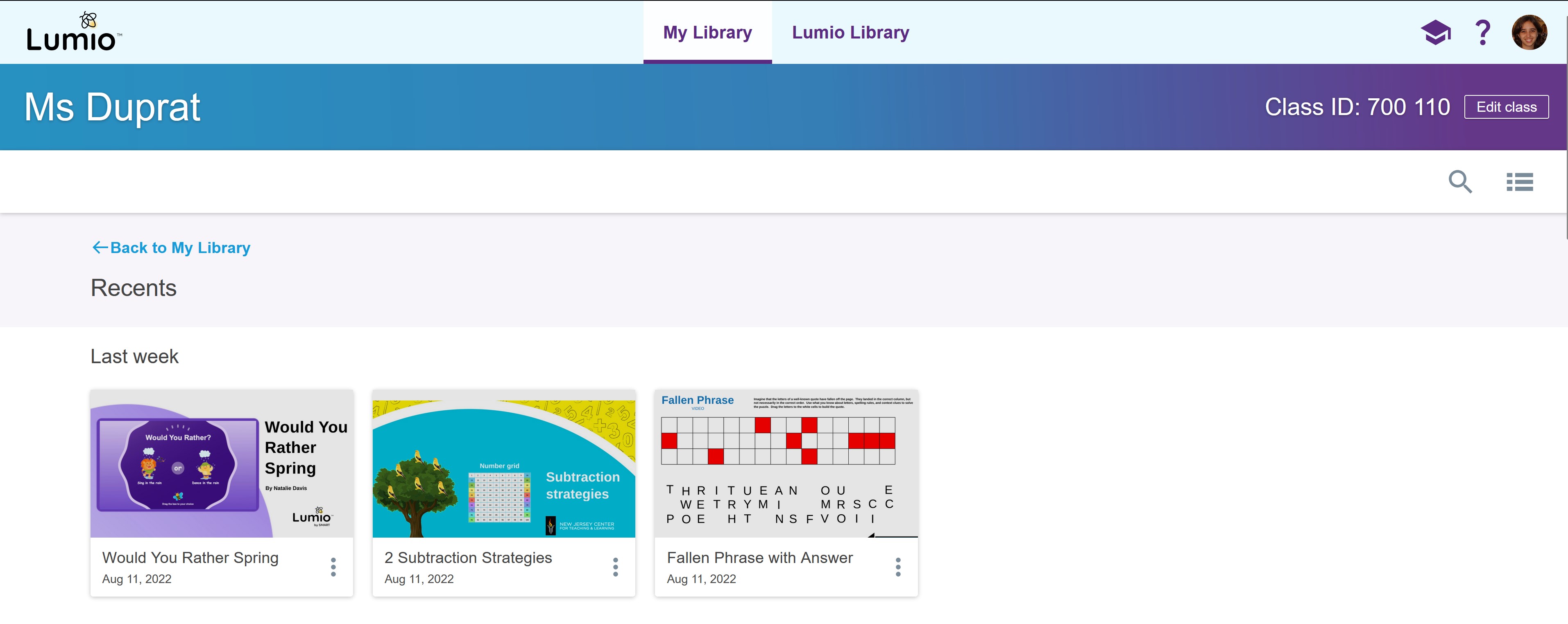
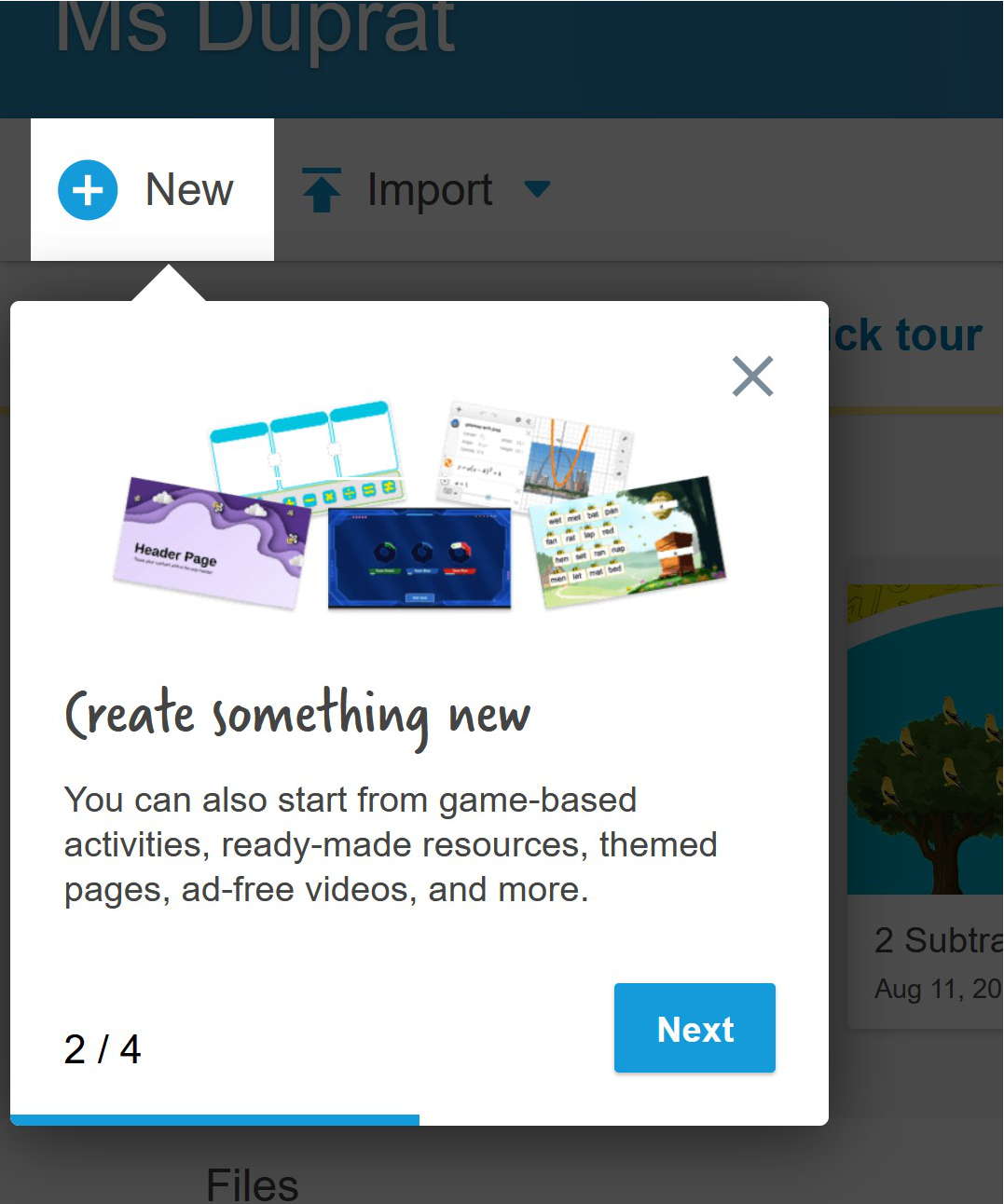
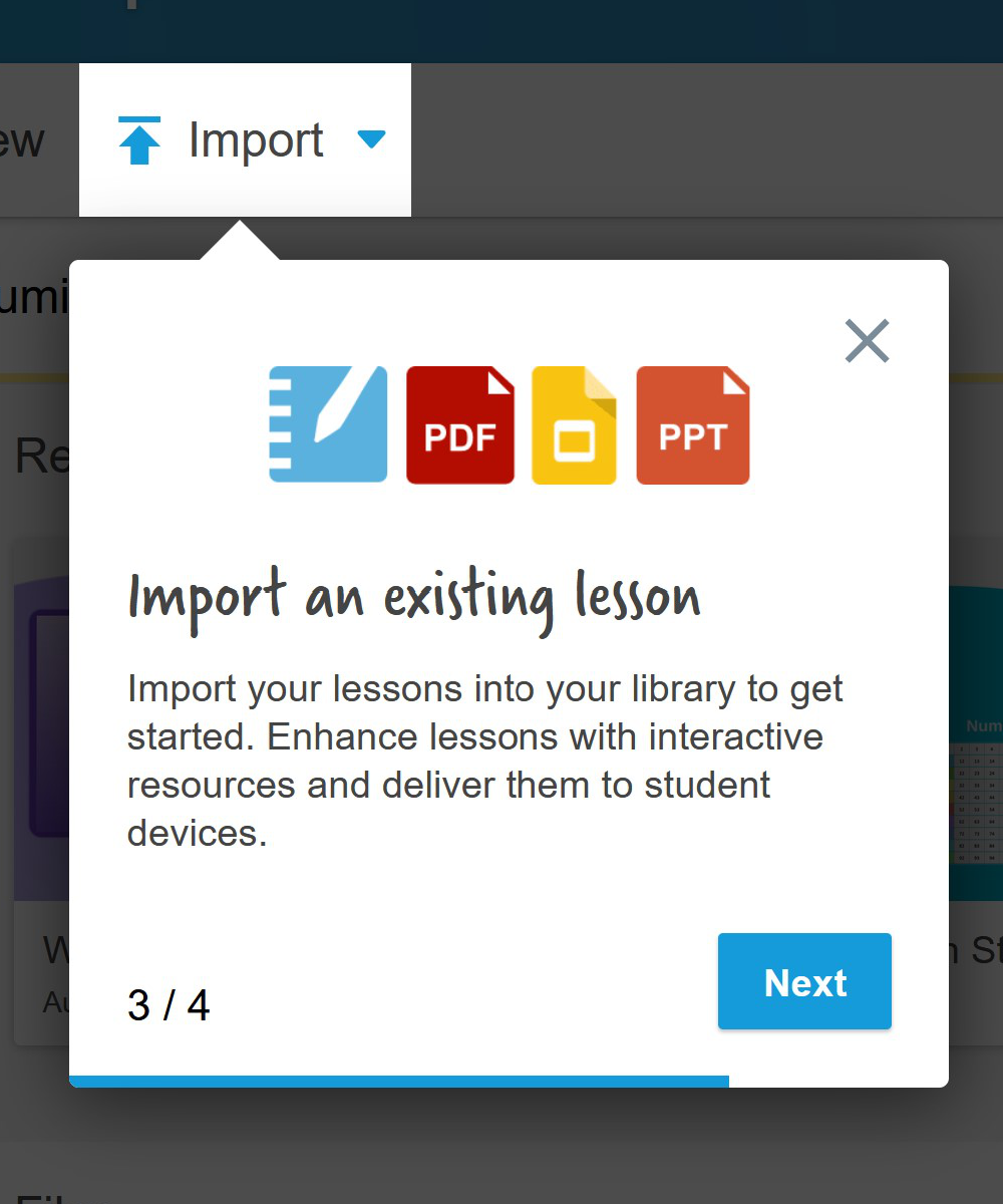
One of the biggest issues was that users coming into the homepage didn't really know where to start from. They saw a big Add activities button, but they had nothing to add it to.
One of the most important pieces of this flow was to create the two main paths of "New" or "Import" so users can start from their own content and then they are guided on how to add things to it from the Edit mode or they can start with something new, with a simple call to action that removes any doubt of where to click on.
Navigation and naming
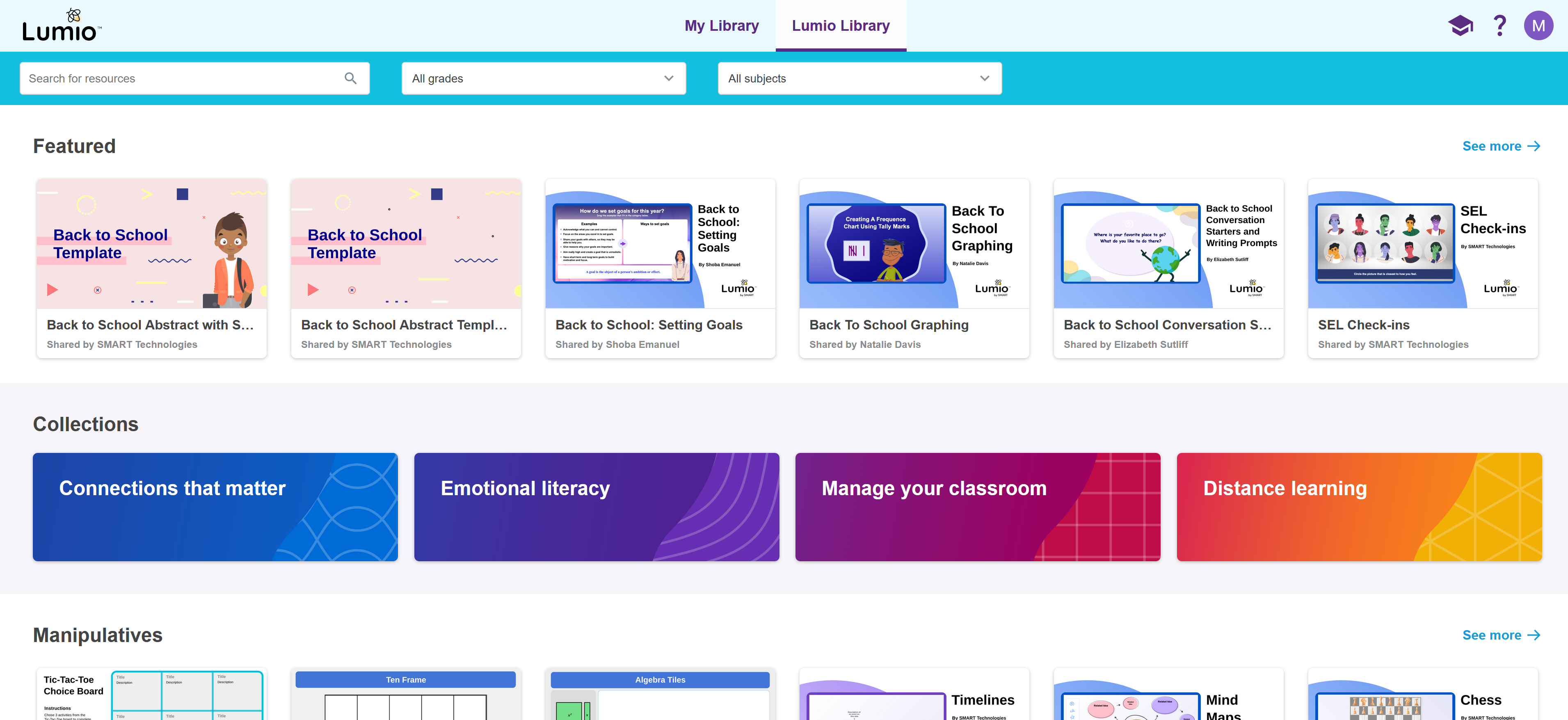
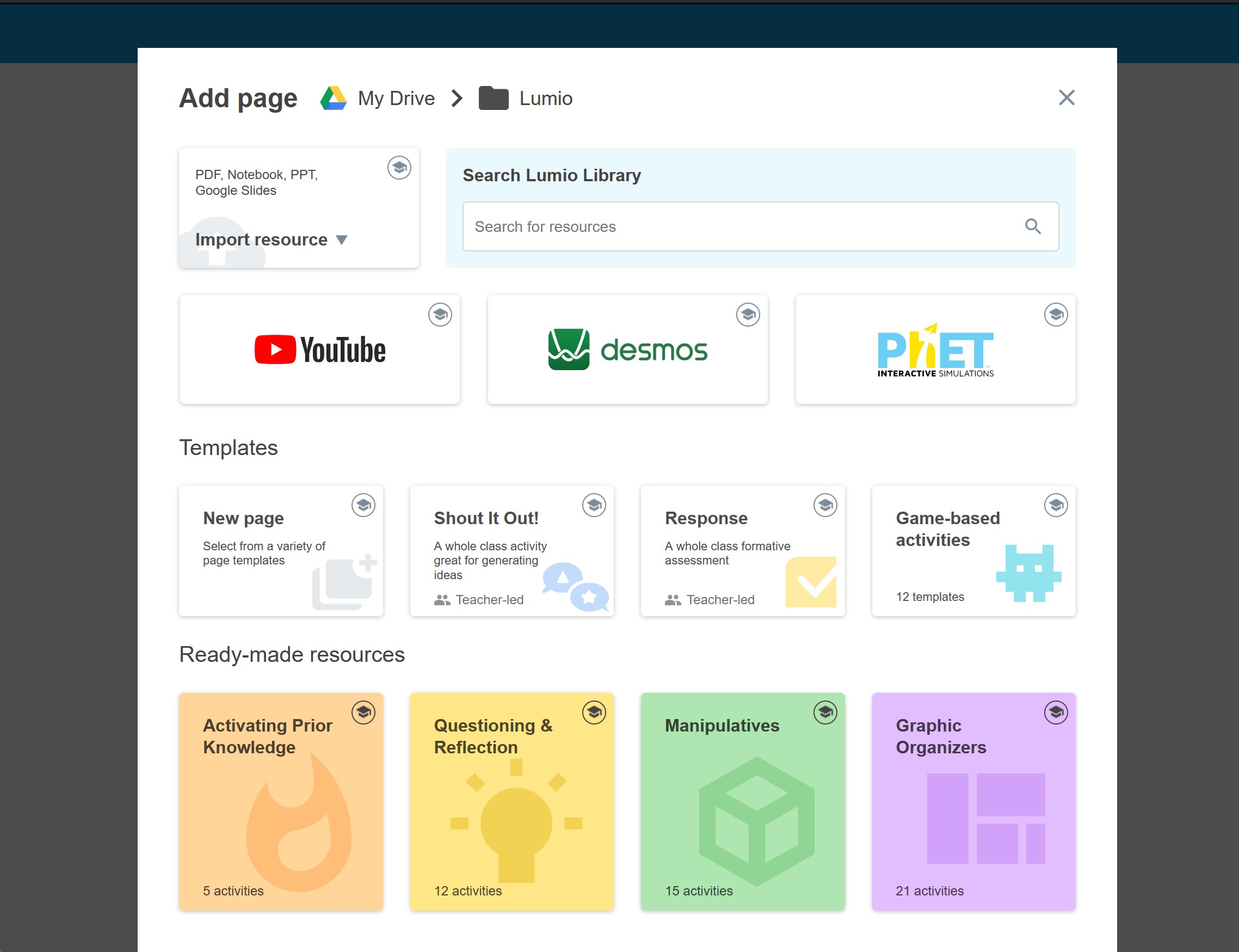
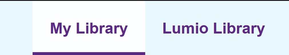
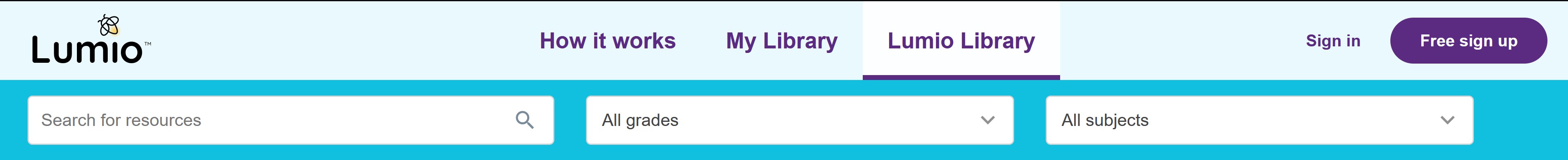
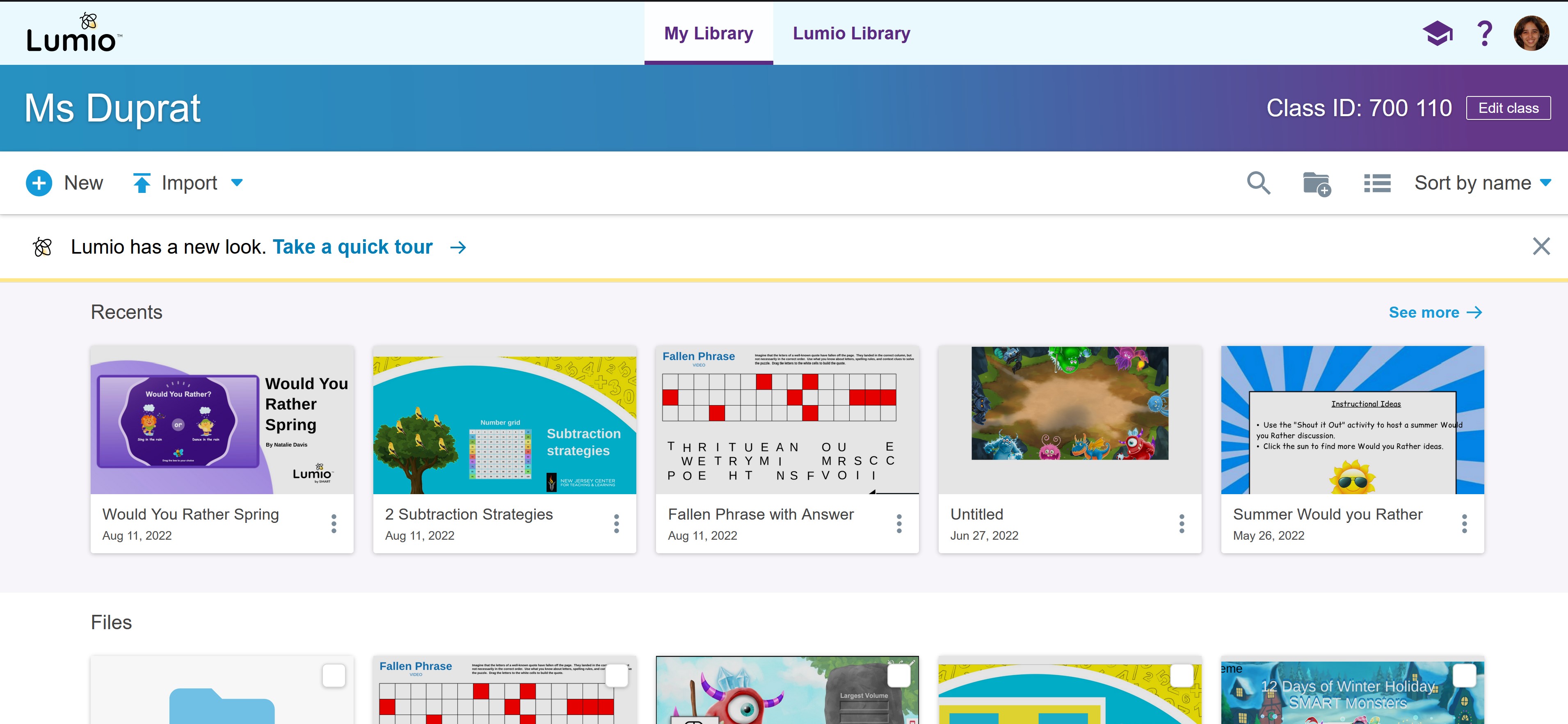
Originally, the library of resources we had created was called "Explore resources", but it wasn't resonating with our users and created some confusion as to what kind of resources they would find there (training, teacher guides, etc). The button on the main page also was not effective in drawing clicks. We decided to rename the library of resources as the "Lumio Library" and officially call the homepage where your files live "My Library".
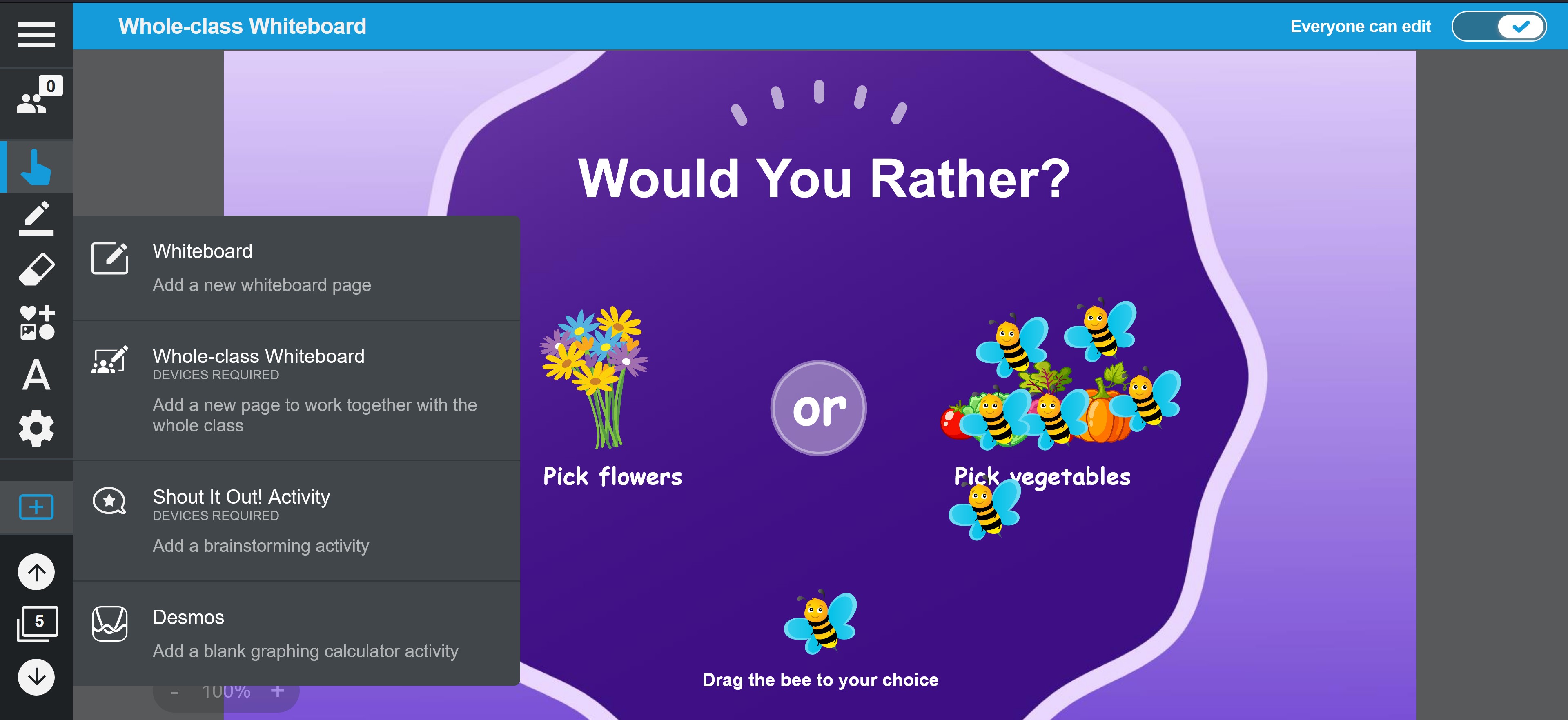
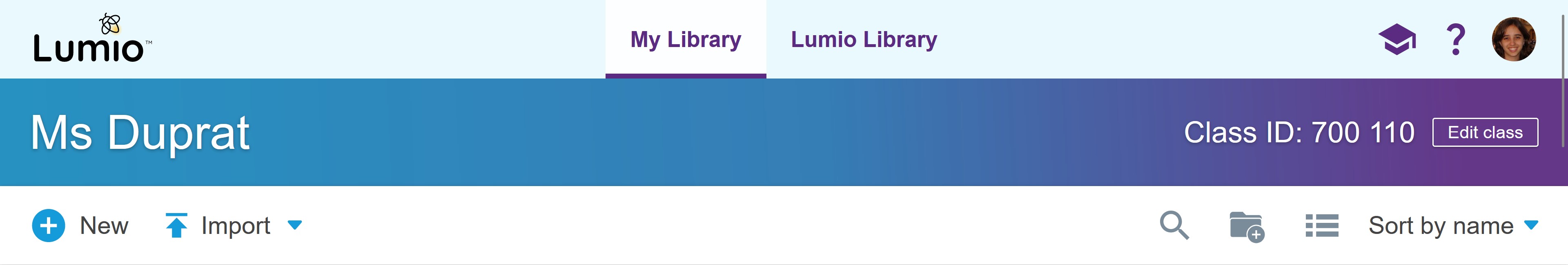
We also included a main navigation bar that helped you navigate between the areas of the product and that can expand to include more areas in the future. I also worked on solving some of the issues in exiting the delivery mode that we found in our research.
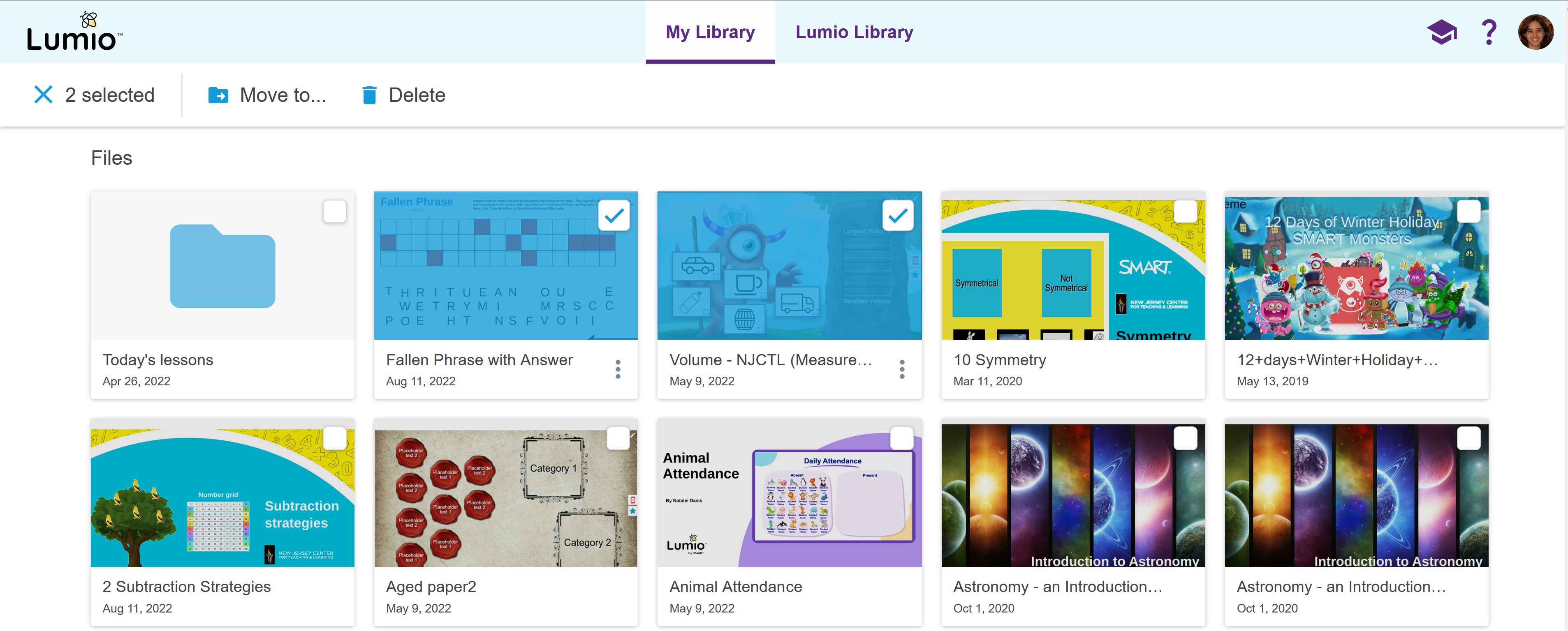
As part of the navigation changes, I created an action bar that also allowed us to have a consistent place where the main actions of each section would exist, as well as a consistent place for secondary actions, such as file sorting and organization. This also helped us to continue to scale the spaces that we have in future features.
Some elements of the main navigation bar were also changed when the user was signed out, allowing them to learn more about the product and how it works and to sign in/sign up.
Onboarding, help and training
We had found that our users were very confused on where to start from and that they didn't discover or understand some of the product's core functionality.
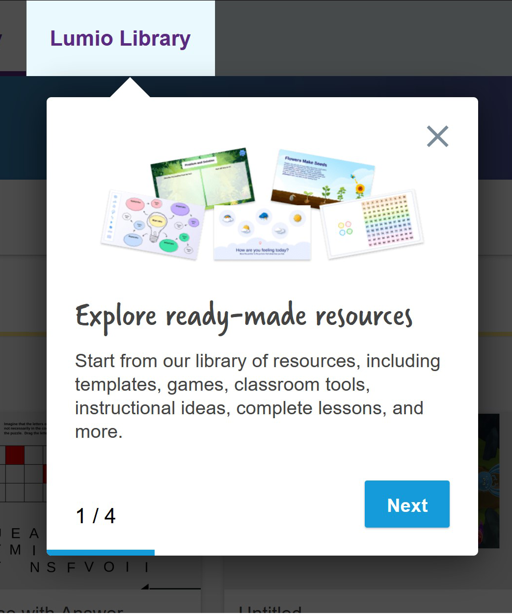
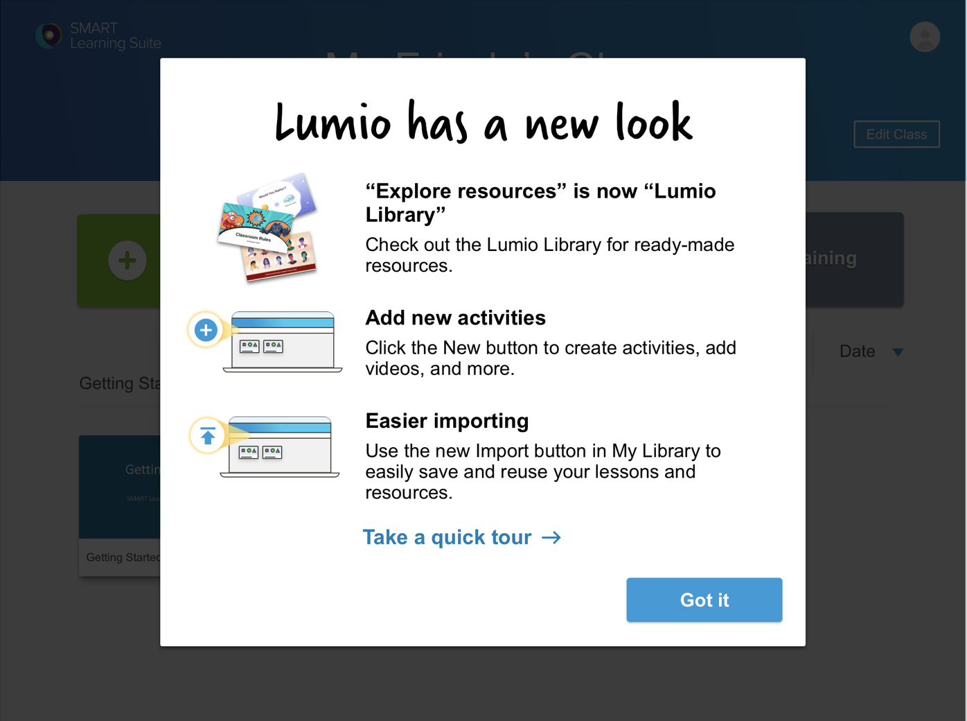
On top of simplifying a lot of the flows and calls to action, I built out a new onboarding flow for when users enter the product that guides them through the main places where they can start creating or importing their resources.
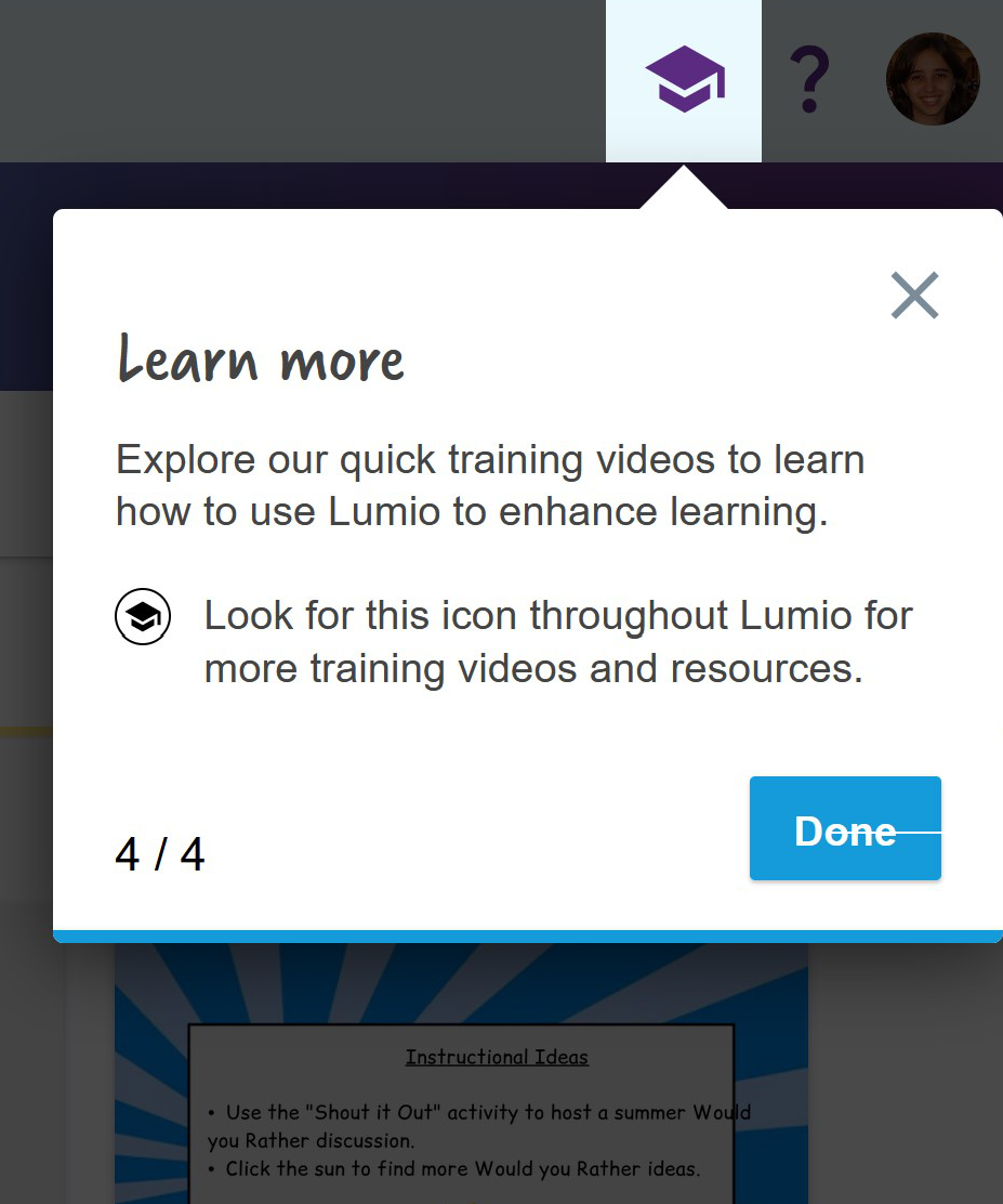
That same flow was re-used to help manage change for existing users, being triggered by either the new feature modal or the new look banner.
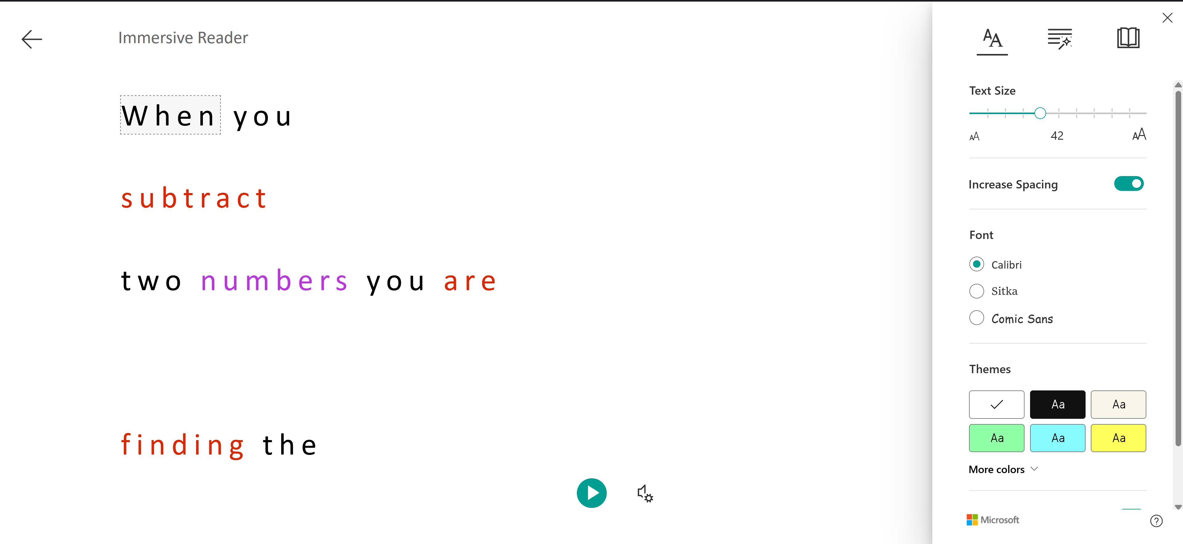
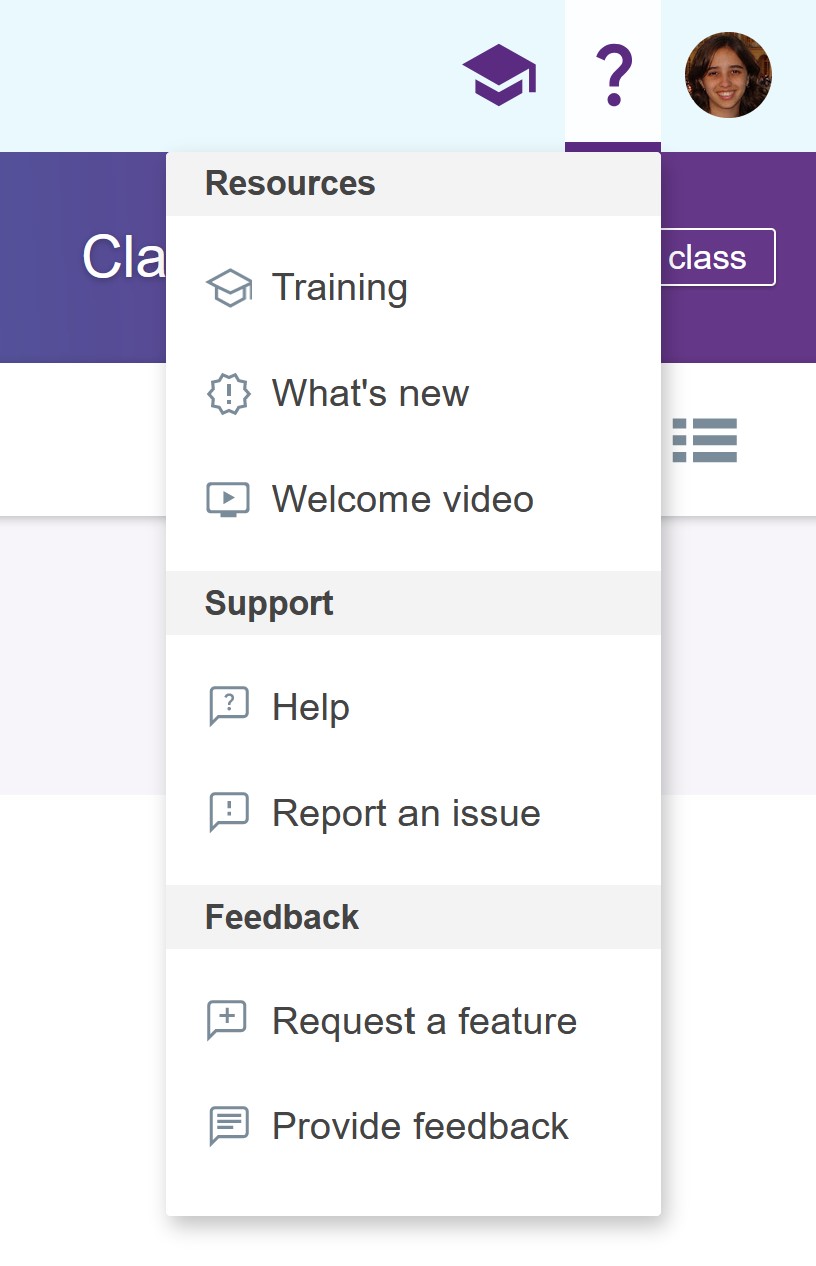
I also worked on organizing our help and training resources that had all been slowly piling up in the user's menu by breaking it out with a tutorial icon and a help menu, divided into sections and with illustrations to help parse through the options.
AFTER: Current Lumio interface
After all these improvements, we have achieved a much more coherent interface that is ready to grow with our future plans.
Next Project
Expo App
App that uses Bluetooth LE technology to bring interactivity to museum exhibits through micro-location