Constructables | 2015
Transformative Learning Technologies Lab
Stanford Graduate School of Education
Internship
Supervisor
Paulo Blikstein
Team
Alicja Żenczykowska
My contributions
User Research
Graphic Design
Interaction Design
Interface of a collaborative platform for teachers and students of Makerspaces, Hackerspaces and Fablabs, named Constructables.
Types of content
The first challenge we encountered in developing this website was when we realized through our user research that there were many different types of information that the users wanted to get from this website. There were also many different objectives that the creators wanted to accomplish.
The main goal was to have a platform that could support the learning process that can be facilitated through fab labs.
Within the main goal, some others became evident:
- Share engaging projects with specific learning goals, guiding teachers through the maker-based learning initiative.
- Provide information about the tools they could use, what to do with them and how to set them up.
- Help people learn the necessary skills to use the tools and to complete the projects, providing supporting material and tutorials.
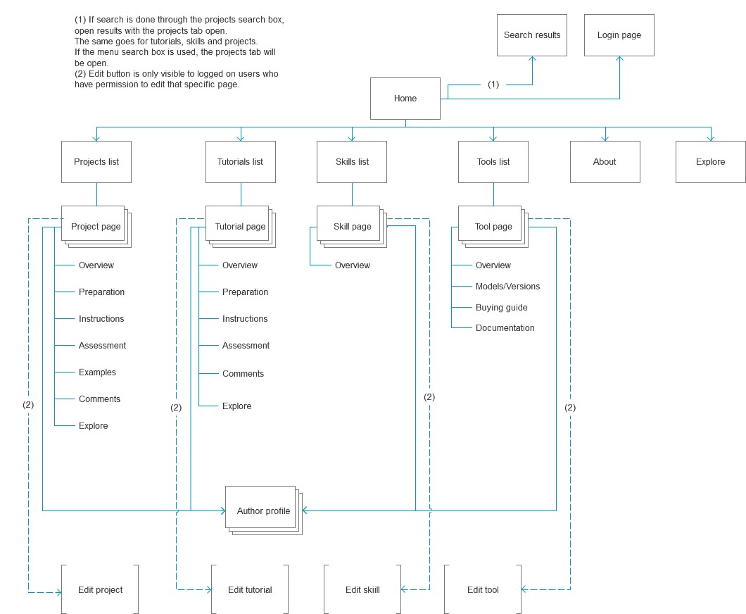
From that discussion, we decided to create 4 types of pages:

Basic structure
From those pages, we expanded the structure:
First Contact
Given the complexity of the website and its content, it was important that we quickly educate our users on their first contact without overwhelming them.
We wanted to accomplish some main goals at the home page:
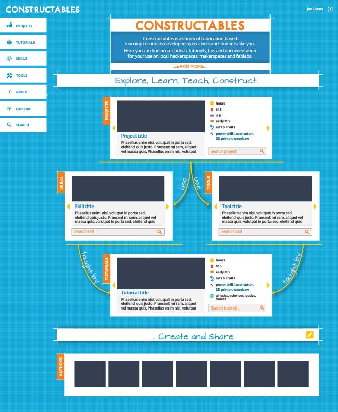
1. Give a quick explanation of what you can find on this website and who it is for:

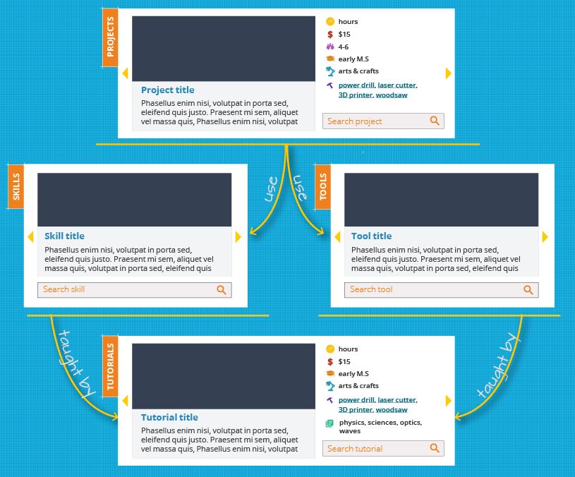
2. Give the user an idea of how the site is structured, explaining the types of pages that you can find (projects, tools, skills and tutorials), as well as the relationships between them:
3. Emphasize the collaborative aspect of the website, inciting them to add their own contributions and showing off a bit of the site's community:

Searching
It also became evident that the search tool would be an essential part of the project. Information should be easy to find and to understand.
Users can search through the projects, skills, tutorials and tools and filter by age, group size, cost, duration and subjects. The type of page that is being searched also alters the available filters.
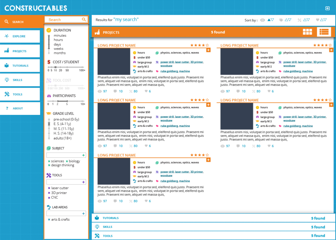
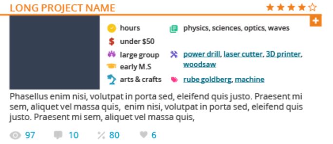
Some of the main information is also evident on the search results, so that the users can make a quicker decision on what really interests them.
This allows them to find the perfect activities for their students, without wasting any time.
Content pages
Each project can be created by steps, with sections on preparation and assessment rubrics.
The links to the tools and skills needed for the project are quickly accessible on the sidebar linking directly to their pages.
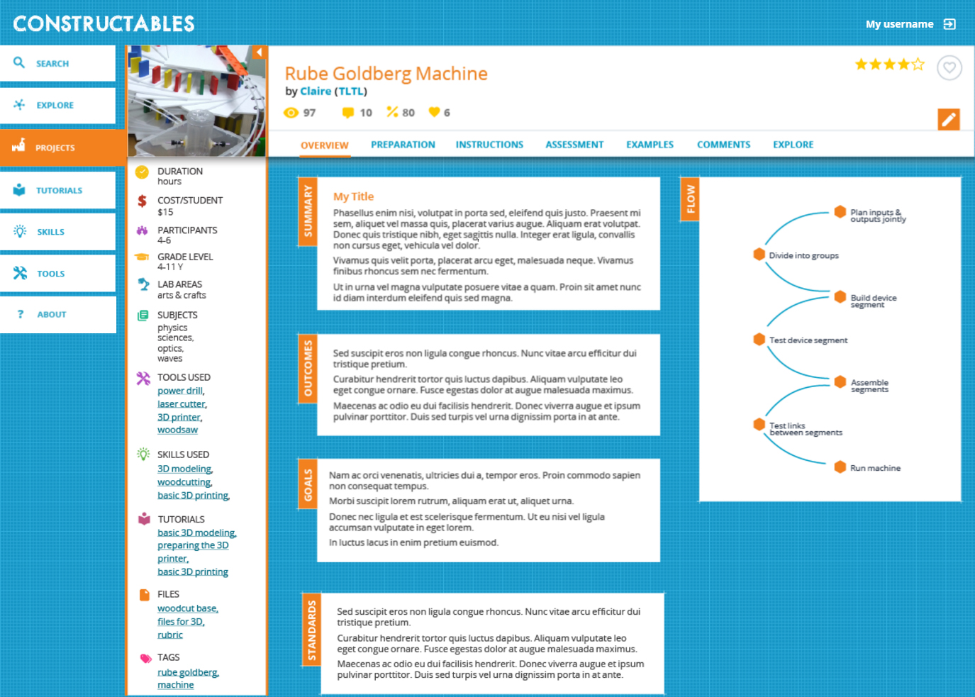
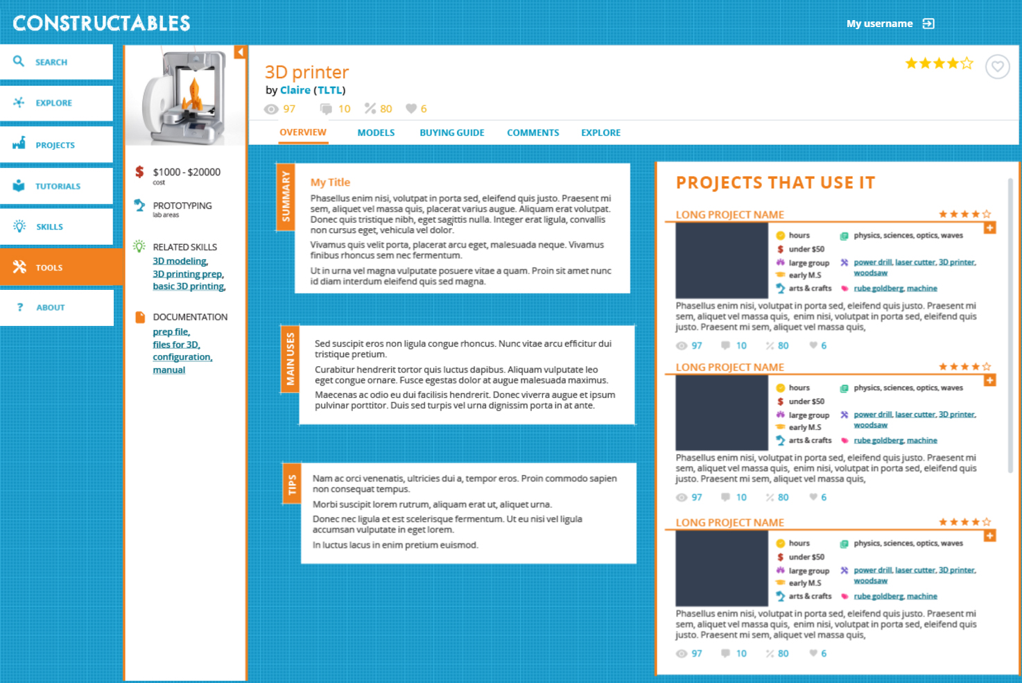
The other page types follow the same structure, with different tabs according to their content.
Previous Project

creat-e
Creativity Inspiring Game
Microsoft Research Design Expo 2007
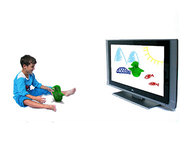
Next Project
e-stoires
Internet of Things project for Electricité de France
