OVNI Lab Brand Development | 2014
Brand design for OVNI Lab, a startup that makes interactive products. Development of the brand, its typography and applications.

Finding the perfect shape
The name ONVI Lab translates to UFO Lab, so we researched alien-related symbols. We wante the brand to be playful and to demonstrate a technological background while also showing the artistic and creative results that we got with our products.
We decided to base the brand on crop circle markings. These shapes were abstract enough to give us the freedom to play with them in different contexts.
We chose marks that were similar to printed circuit boards to also convey the technological aspect of the company.


From this inspiration, I created some options of geometrical shapes based on the researched images.


We chose the last form due to it's simplicity. The symbol also showed a potential of creating very versatile applications.

Refinement
The font of that option, however, wasn't complementing the geometrical shapes as well as I had hoped. Because of that, I decided to design my own extremely geometrical font.

The shape was then refined to provide the ideal contrasts in different applications. I also added another circle to the shape so we could give it a directionality.

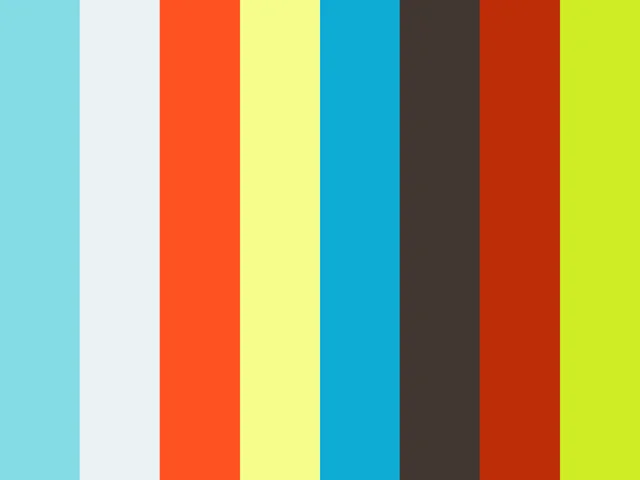
With a good logo at hand, I chose a color palette for the company, starting by a main color scheme for the logo, considering its applications on different techniques and backgrounds.

Afterwards, creating a broader palette and defining the possible applications within each color.


Applications
Using the newly defined logo, I created several different applications, playing with the color palette and the symbol.
Calling cards

Texture using the symbol for a Facebook cover photo

Labels

Company T-shirts

Logo animation for corporate videos

Previous Project

Product manuals
Visual step-by-step manuals to guarantee a seamless experience or OVNI Lab's interactive modules

Next Project

Bizz magazine
Creation of a new magazine framework as an academic project
